iOS 7 Review
iOS 7
It's a huge improvement, but there's little for Google to fear here.

Sections
- Page 1 iOS 7 Review
- Page 2 iOS 7: Notifications Center and Control Center Review
- Page 3 Mail, Calendar, Reminders and Notes Review
- Page 4 Camera and Photos Review
- Page 5 Safari, Maps, iTunes and iTunes Radio Review
- Page 6 Siri and AirDrop Review
- Page 7 Performance, Battery Life and Verdict Review
Verdict
Pros
- Fresh, modern and slick
- Camera app is outstanding
- Effortlessly simple
Cons
- Few new, essential features
- Mainly playing catch-up to rival OSes
What is iOS 7?
iOS 7 is the most serious update to iOS since Apple opened the App Store. Let that sink in for a moment, because it’s important. iOS and the iPhone may have been a catalyst for a revolution in smartphone software and hardware design, but it’s the App Store that’s made the iPhone a success. “There’s an app for that”. It’s a catchy line.
But as the App Store flourished and became the bedrock of the iPhone’s success, iOS floundered. It began to look staid, old-fashioned and short of ideas, particularly compared to the fresh new look and experience offered by Microsoft’s Windows Phone. Designs that made sense in the advent of touchscreen phones slowly began to look anachronistic.
Worse still, Apple’s moves to improve and augment iOS became hopelessly disjointed. The disastrous Apple Maps was the catalyst for change and the ousting of former iOS chief Scott Forstall, but the likes of Find My Friends, Cards and the Podcasts app were unheeded warnings.
Apple bills iOS 7 as “the mobile OS from a whole new perspective”. The antidote to growing unrest among even ardent Apple fans. Can it live up this billing and will it add value to the recently luanched iPhone 5S and iPhone 5C?
What’s Next: iOS 8 release date, rumours, features, apps and news
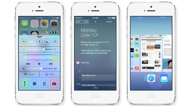
See iOS 7 in action in Apple’s iOS 7 video showreel:
iOS 7: First Impressions
That “new perspective” line is an interesting one. It’s typical Apple bravura, the kind that drives its fiercest critics into a wild rage. And it’s easy to see why because, look past the new modern veneer, and the core iOS experience remains very much intact.
You have a grid of apps and app folders; you swipe left and right to reveal more apps; tap on icons to open apps; go to the App Store to download more apps… it doesn’t feel like a “new perspective”.

There’s two ways to read this, as Apple failing to innovate or Apple playing to its strengths. Whichever narrative you prefer doesn’t change the first impression that iOS 7 is a refreshing, vital, but very comfortable update. It’s an old, familiar friend who has thrown off the cardigans and had a shave.
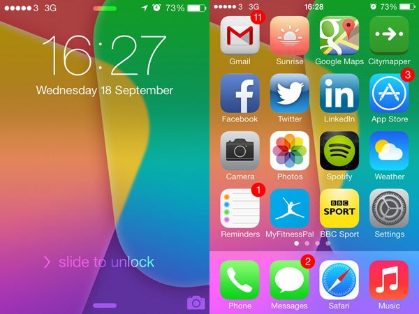
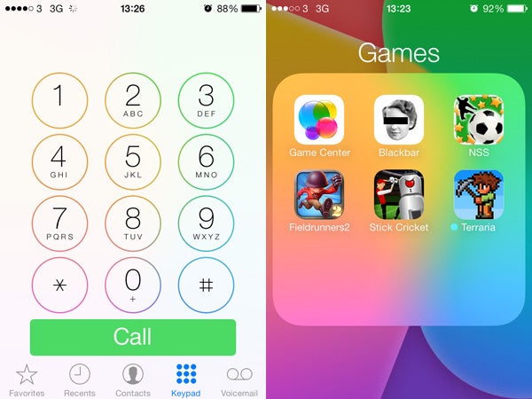
Key to this is the new visual style. There’s been much pontificating on the topic of ‘flat design’ vs the ‘skeuomorph’ approach of previous versions of iOS. It’s quite a boring debate really, but Apple has ripped away the worst offences of the latter-day Forstall-era. Some tiny hints remain, such as an almost paper-like texture to the Notes app background, but they’re appropriate rather than hackneyed.
More to the point, everything about the visual style in iOS 7 feels modern, fresh and effortless. The familiar tropes, such as slide to unlock, remain, but with none of the baggage. Anyone who upgrades their existing iPhone or iPad will, for a short time at least, feel like it’s been given a new lease of life.
Key to this is the sense of ‘levels’ that pervades iOS 7. This is where that ‘new perspective’ line begins to resonate, even if it’s a bombastic way to describe a simple effect. Overlays have a subtle translucency that just hint at what’s below, without it ever becoming a distraction, while the new ‘parallax’ wallpapers move slightly as you tilt the screen.

Also key is the way OS moves and reacts to your prompts. Apps now appear to expand from the icons, while the screen fades in and out when you lock and unlock the phone. Apple has adopted the ‘cards’ app switching approach of the now defunct Palm OS, where double-tapping the home button shows previews of open apps. None of this is groundbreaking stuff, of course, but the cumulative effect all helps to make iOS 7 a pleasure to use day-to-day.
The sights and sounds are improved, too. There’s a new set of default backgrounds, the introduction of ‘dynamic’ moving wallpapers (a mixed blessing, really), and a whole new set of ringtones and alert sounds. The old ones remain, but the new ones subtly hint at the modernity of iOS 7. The old sounds are tucked away in their own section earmarked ‘Classic’ – a very polite way to put it.
In purely aesthetics terms, then, iOS 7 is a huge success. It looks and feels great, but there’s a good deal more it needs to do convince the doubters. Read on as we delve deeper into the new features and redesigned native apps.
How we test phones
We test every mobile phone we review thoroughly. We use industry standard tests to compare features properly and we use the phone as our main device over the review period. We’ll always tell you what we find and we never, ever, accept money to review a product.

