Verdict
Key Specifications
- Added-colour design
- Adaptive Battery
- Updated volume controls
- Text select magnification
- Gesture nav mode
- Flat Recent Apps display
- 802.11mc Wi-Fi support
What is Android 9 Pie?
Google’s big mobile software update for 2018 is Android 9 Pie, or ‘P’. And it’s out for Google’s own Pixel phones. That includes the original Pixel and Pixel XL, plus the Pixel 2 and Pixel 2 XL. Expect to see it come running on the upcoming Pixel 3, too.
Top features include a tweaked look, altered volume controls and a new battery mode. I’ve tried these out in Android P’s beta versions, and now the final release.
How to download and install Android Pie on your Pixel phone today
It’s a solid update. However, as of August 2018, several of the software’s most interesting features are missing, including its ‘digital wellness’ suite. As such, there’s no score score on this review.
Google may call this a full release, but Android Pie has a few slices missing. And that’s the last ‘pie’ pun you’ll find in this review.
Android 9 Pie – A tweaked Material look
When Material Design arrived in Android 5.0, it seemed a way for Android to finally catch up with iOS simple aesthetic appeal. It was a consistent, cute look found across Google’s apps and services.
However, Google Pixel phones have started to look a little too ‘stiff’ next to some third-party alternatives. Changes in Android Pie aim to address these concerns, as if its designers realised that wearing a slim-fitting, v-neck T-shirt for four years doesn’t constitute ‘style’.
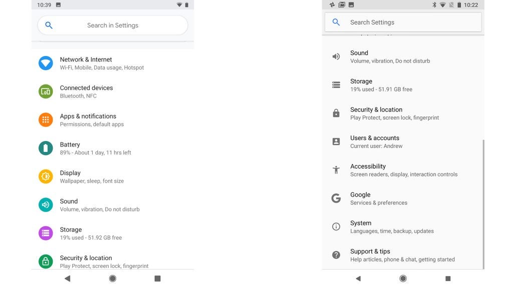
Android 9 Pie offers far more colour. Feature switches in the dropdown control centre are blue circles rather than plain text icons. And the virtually monochrome Settings menu of Android 8.0 has been filled with colourful icons. It looks more like the Settings area of a Samsung phone.
Related: Best Android phones
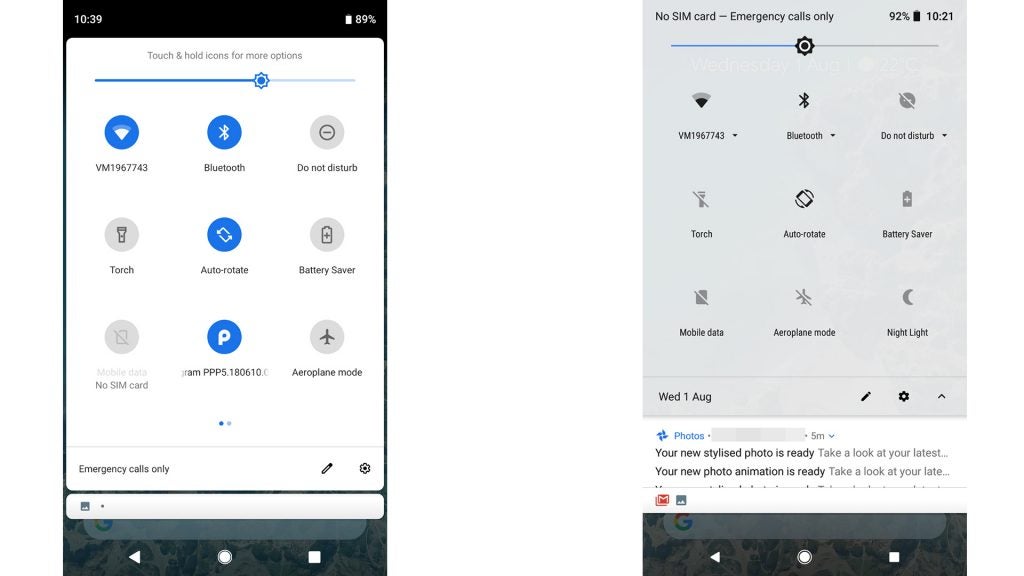
Android 9.0 (left), Android 8.1.0 (right)
Android 9.0 (left), Android 8.1.0 (right)
Is it distinctly better? No, it’s just different. But as someone who switches between different Android UIs almost every week, I do find the Android 8.0 Pixel UI a little plain.
The homescreen has barely changed, however. Android Pie moves the clock from the top right to the top left, but that’s about it.
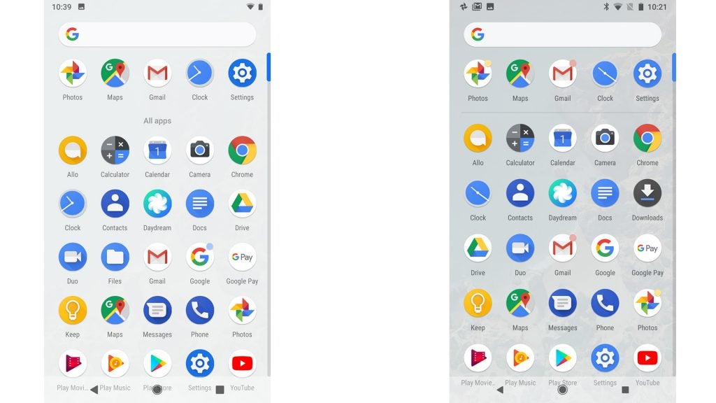
Android 9.0 (left), Android 8.1.0 (right)
There hasn’t been much movement in the apps menu either, aside from the App Actions feature. Comparing directly to the Pixel 2 with Android 8.1.0 just before the update, the older interface uses a slightly more translucent background, revealing the homescreen background more clearly.
Android 9.0 Pie has a near-opaque app drawer background. Big whoop.
The biggest visual change is seen in the Recent Apps multitasking screen. Previously, app screens appeared as a semi-3D cascade, with only one ‘frozen’ app clearly visible on-screen at once.
Related: Best phone 2018
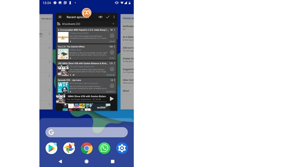
Android Pie uses flat app previews, which you flick through like playing cards arranged on a table. This looks more like iOS’s multi-tasking – and that’s no criticism. It makes fast app-switching slightly less frustrating, and the page fits the visual style of the rest of the system better.
There’s also more packed into this multi-tasking screen. Two core elements from the top of the app drawer, the universal search bar and a row of apps icons, sit at the bottom of this screen.
Android 9 Pie – Gesture nav
This may seem a little odd until you play with Android Pie and become aware of where the recent apps menu sits.
In Android Oreo, the apps drawer sits ‘below’ the homescreen. You flick up to get to it, moving to page 2 of a book. The Recent Apps part appears to be ‘behind’ the homescreen, as if you’re flipping all the way to the index section at the back of a book.
That changes in Android Pie. The Recent Apps part is meant to feel much closer to the surface of the interface.
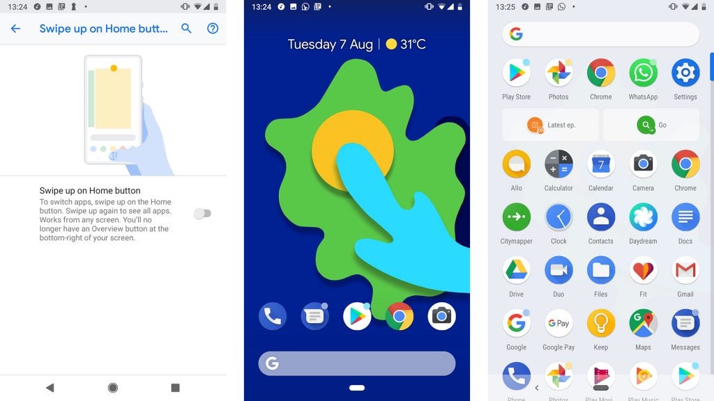
This becomes clear when you switch on Gesture Navigation, one of Android 9 Pie’s key features at launch. It replaces the usual three soft keys with one, although a ‘back’ button appears next to it when appropriate.
One flick up on it from the homescreen takes you to Recent Apps, a second to the App Drawer. The app-switching screen is now ‘between’ the homescreens and app catalogue, not behind or beneath them.
It took me a while to get used to this change. But, ultimately, it did make me aware of the frequency with which I use app switching, and that the new Recent Apps page is better than the old one.
For now, though, I’m sticking to the old-fashioned soft keys. It feels more familiar, obviously, and lets you access both the drawer and Recent Apps screens with a single button press or gesture.
If you have Android Pie and want to try this gesture nav approach, it’s found in Settings > Gestures.
Android 9 Pie – Screenshots and images
Most other interface tweaks are baked in, and less contentious.
First, larger image previews can now appear in the notifications bar, as part of message alerts. It’s something devs will have to incorporate, but you can see what it will look like from a screenshot sample:
You can expect these kind of image previews to be used by WhatsApp and other messenger apps, although it doesn’t work with WhatsApp yet.
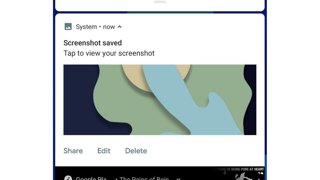
The way in which Android Pie treats screenshots is also different. You still press power and volume down to capture one, but instead of a quick preview of the screen, you’ll also see a system notification appear at the top of the screen.
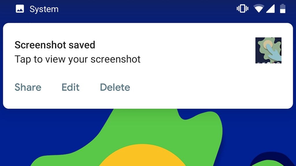
This lets you quickly share screenshots. I use screengrabs all the time as an easy way to share Facebook posts, amusing images and other messages, usually via WhatsApp. This new mechanic makes it much clearer that you don’t have to capture such images and then share them from the gallery.
There’s also a quick button to edit them, usually a crop in my case. And if you don’t want to share or edit the screengrab, it will just end up in the gallery.
Android 9 Pie – Volume
The new interface design also addresses a long-standing issue some have had with Android’s volume controls. There are three types of volume in an Android phone: media, notifications/alerts and alarms.
Traditionally, Android alters the notification volume as standard, unless a game or audio is playing at the time. Android 9.0 Pie makes media volume the default. This may not seem to make a great deal of sense, until you try to play a Spotify song to someone at the office, only for it to spit out at maximum volume – and you’re left scrambling for the volume buttons, red-faced.
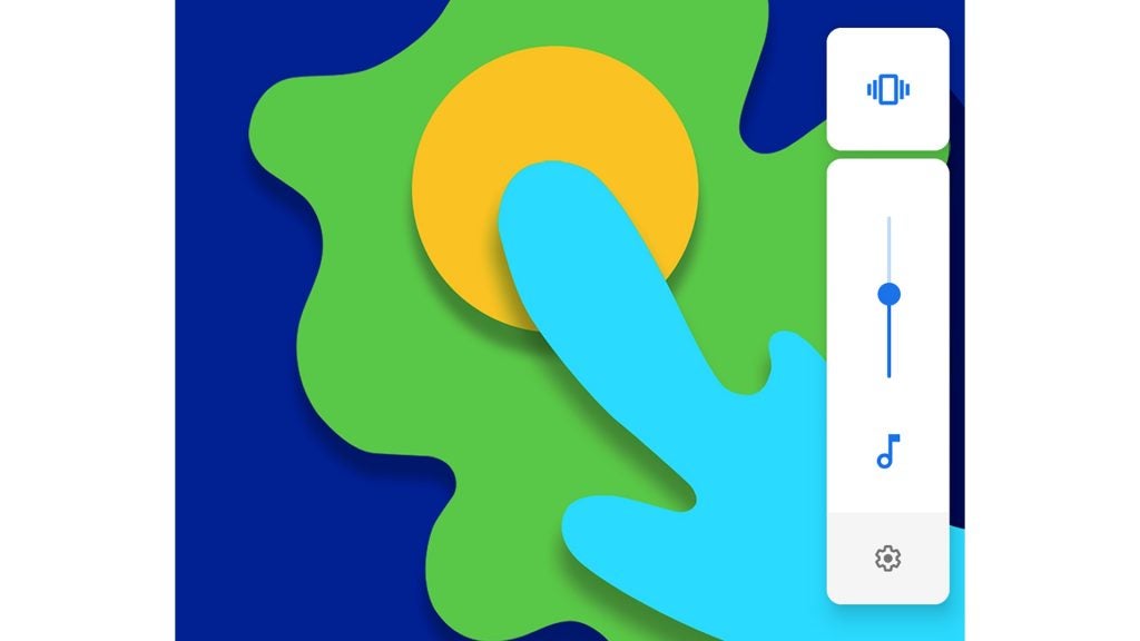
A button above allows you to switch between vibrate, silent and standard notification modes. And if you actually need to alter notification volume properly, a long press takes you to an area in Settings with the usual volume sliders.
This is the part of Android 9 Pie I appreciate most at the moment. I use my phone to play audio, Spotify and podcasts, more than anything else.
Android 9 Pie – App Actions
Playing audio highlights another key Android Pie addition: App Actions. These bring shortcuts from installed apps onto the app drawer page, in (up to) two little boxes just below the first row of app icons.
You don’t choose what goes here, Android Pie does, based on your behaviour. Shortcuts I’ve seen in this spot include playing Spotify’s Discovery Weekly playlist, starting an activity in Google Fit, and playing the “most recent” episode in Podcast Addict.
Related: Best phone 2018
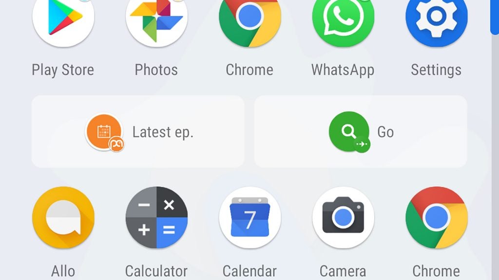
Similar shortcuts already exist in Android Oreo, found by long-pressing an app icon. However, I’ve never seen someone use these. App Actions makes us much more likely to use them, but I’m torn on their effect.
These shortcuts make the apps page look less clean. They’re AI picked widgets for the app drawer, and virtually everyone stopped using widgets years ago.
Google says we’ll also see similar shortcuts appear in areas such as universal search results, but they don’t seem to be active in this initial version of Android Pie.
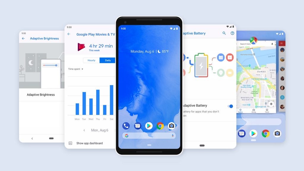
Android 9 Pie – Adaptive Battery and performance
Analysis of how you use your phone is also used to improve battery life, through Adaptive Battery. This may seem like a brand-new feature, but it’s actually an evolution of long-standing behind-the-scenes battery optimisation in the operating system.
Apps you use frequently have fairly free-ish access to background processes and data use. Those you’ve run once and haven’t touched since are tightly restricted, ensuring they don’t suck up battery without purpose.
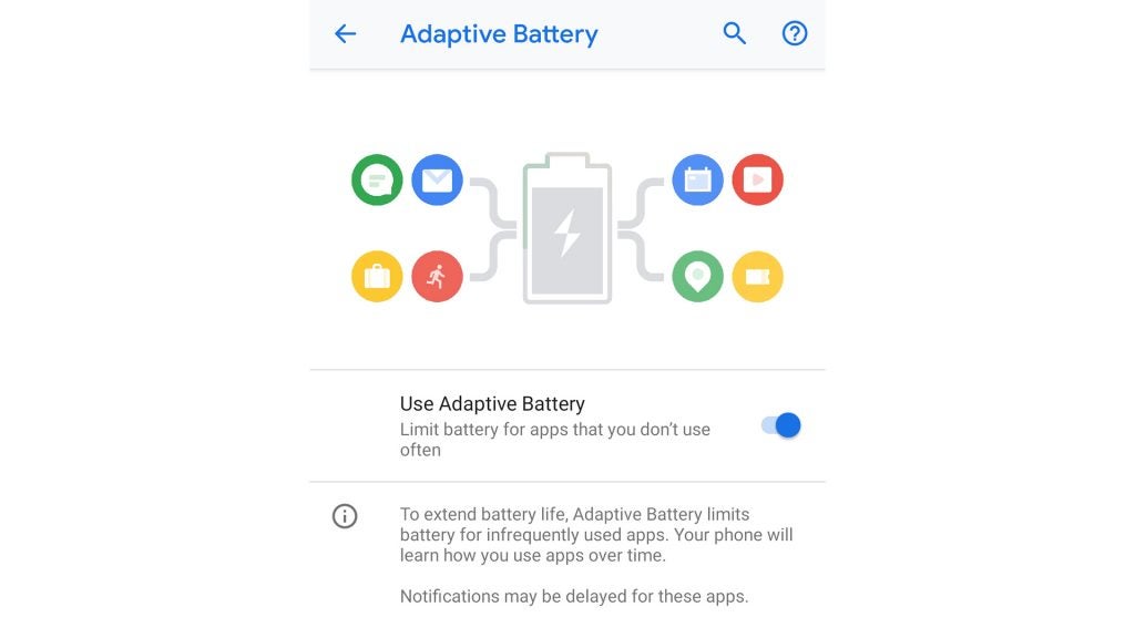
It’s a fairly intuitive approach to power management that appears to be similar to Doze, a feature of Android M and N that reduces battery use while the phone is in standby. Does it radically improve battery life? Not that I’ve seen, although it should help avoid phantom power drain months-in, when you’ve accrued a whole bunch of apps that you used for only a couple of days.
General performance doesn’t seem to be affected by the shift to Android Pie, although I have noticed a rare fractional delay in basic interface navigation.
Android 9 Pie – Text select magnification
Back to the unequivocally good stuff: text selection is less fiddly in Android Pie. You still long-press a word to bring up the selection tool, and drag markers to choose the right phrase or sentences.
However, there’s now also a Magnification view of the part under your finger. This makes selecting small phrases, or any text in zoomed-out articles easier.
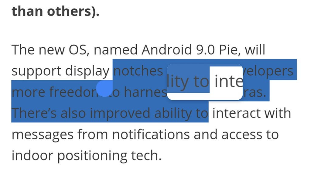
The fiddliness of this function in older versions of Android is part of the reason I use the screenshot function so regularly these days. This change arrives a little too late to take me back, but selecting text does feel a lot better. It’s more like doing so with an iPhone, which has a similar magnification feature.
Android 9 Pie – Usage monitoring
Not every important feature of Android Pie is live yet, however. The most talked-about is missing: app use monitoring and restriction.
That we’re all frying our brains with compulsive social app use is a recurring idea of the moment. Android Pie will let you monitor how long you spend in apps over time in Dashboard, and restrict your access to them per day with App Timer.
Five years ago, this would have been about ensuring you refrained from spending five hours a day playing Candy Crush Saga. However, right now, social apps are the prime targets.
FaceBook, Instagram, Twitter and YouTube are great candidates for this kind of feature, if you quietly wish you didn’t spend so much time flicking through feeds or entering a YouTube ‘suggested video’ vortex.
Related: iOS 12 preview
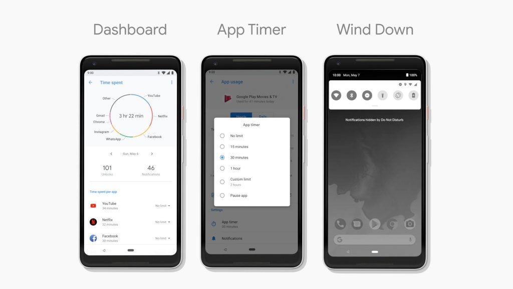
The passive (Dashboard) side of usage monitoring seems unlikely to be particularly useful. Android phones already give you a view of the amount of battery and RAM consumed. The Dashboard seems a comparable feature I might dip into every few months, look at the stats slightly horrified, and then continue more-or-less as before.
Allocating app time limits may be a ‘nanny state’-style approach, but it’s also perhaps the best way to become more mindful about your actual phone use.
The idea that this will solve the problem of unhealthy phone use is ridiculous. However, like the Pomodoro Technique, it should be genuinely useful for those with the willpower to stick to it, using it to reverse unhealthy habits over time.
App Timers are coming later this year. And when you run out of ‘allowance’, the app will grey out, restricting access.
A new ‘bed time’ mode is coming, too, called Wind Down. Right now there’s Night Light and Do Not Disturb. These let you set a ‘sleep’ time, during which you won’t be disturbed by notifications, and the display turns amber in the evening to reduce the display’s blue light quotient. Using your phone before sleep isn’t a great idea in any case, but reducing the blue light spectrum output can decrease eye strain and sleep disturbance.
Wind Down brings these features together and adds a greyscale mode that kicks in to say: it’s time to put the phone down and go to bed.
The digital wellness parts of Android Pie are those I’m most keen to check out. Without them, this isn’t the full Android 9 experience. However, I’d rather Google releases them stable and well-optimised than as a wobbly mess that destabilises the entire system.
Android 9 Pie – 802.11mc and indoors mapping
There’s another feature even further off, too. Android Pie adds support for 802.11mc. This lets a phone triangulate its position indoors, and will be used to inform Google Maps tracking. It relies on multiple Wi-Fi hotspot signals in the area, but your phone doesn’t have to be connected to them.
We’ll finally be able to see where we’re going properly when in shopping centres and big supermarkets. Great. But Google will inevitably use this to further inform ad profiles and make more money with our data. Oh well.
At the moment it isn’t clear which phones are ready to use 802.11mc. However, a dig into Wi-Fi supported standards suggests phones with Qualcomm flagship processors of the Snapdragon 820 generation or newer should be able to get on-board.
Opening verdict
The initial Android Pie release isn’t the full package. It doesn’t have the digital wellness tools that could help wean you off an unhealthy social media obsession. And other parts need to be adopted by third-party developers before we’ll see them represented fully.
However, there’s little to dislike strongly here. Performance and stability appear solid, useful interface tweaks are peppered throughout, and the contentious gesture navigation feature is optional.
Are App Actions worth the visual impact they have on the app drawer? Perhaps not. But this rests on how much you’re into a simple look for software. Google should consider adding an option to turn them off.
Trusted Score

Editorial independence
Editorial independence means being able to give an unbiased verdict about a product or company, with the avoidance of conflicts of interest. To ensure this is possible, every member of the editorial staff follows a clear code of conduct.
Professional conduct
We also expect our journalists to follow clear ethical standards in their work. Our staff members must strive for honesty and accuracy in everything they do. We follow the IPSO Editors’ code of practice to underpin these standards.