The new iOS and Android YouTube design looks great

YouTube is rolling out a new interface for its mobile app that will make it easier to like and comment on videos.
Anyone who watches YouTube on their phone may have noticed a few changes.
This new UI hasn’t been rolled out to all users, though some people have noticed that the YouTube app looks slightly different than before, with easier access to buttons.
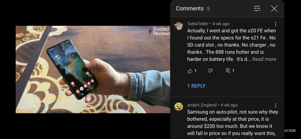
When you’re watching in portrait mode there isn’t much difference, but when watching in landscape mode users now have the option to like, dislike or share a video, as well as check out the comments.
Now you can scroll through comments as you watch and even type out a response yourself by tapping the comment button. Previously, this could not be done in landscape mode, and you had to be watching portrait to check out what people were saying.
Another feature that the new UI brought in was the ability to like, dislike, share and save videos while in landscape mode.
The older UI allowed you to do this, however, it was bogged down by other video options. The new interface has a much sleeker design and moves the related videos section to a small button in the corner.
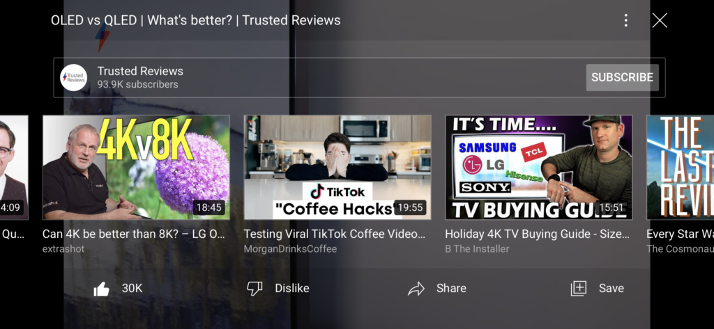
Interestingly enough, these screenshots were taken on the same phone, which suggests that the new interface could have been rolled out in stages for some users, as my iPhone only features the new comment interface, while leaving me with the original like buttons.
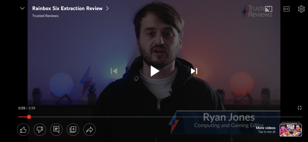
Looking at the image above, this version of the UI means you can interact with the video without the distractions of the related videos, with the aforementioned comments button in the lower-left corner bringing up the comments thread.
According to Google, the new UI will be officially rolling out on 7 February, so anyone who hasn’t seen the updated features, or has only seen a few, will be able to test out this new design very soon.


