Android Marshmallow Review - Privacy, permissions, design Review
Privacy, permissions, design
The most complete version of Android yet

Sections
- Page 1 Android Marshmallow Review
- Page 2 Privacy, permissions, design Review
- Page 3 Fingerprint sensors, USB-C, Android Pay, Flex Storage, verdict Review
Android 6.0 Marshmallow review – Privacy and Permissions
Permissions have received a complete overhaul in Marshmallow – and they were needed. You now have far more granular control over exactly which apps have access to what system functions.
In prior versions, you’d have to accept all of an apps permissions upon install. So if an app wanted access to your phone, camera and contacts, you’d have no choice but to tap “OK”.

In Marshmallow, you’ll still receive these permission overviews when you install, but you’ll also get prompts for a second time when you open an app. For example, Instagram will ask if it can use your camera when you first fire it up.
If you’ve used an iPhone then you’ll be aware that this is exacty how iOS handle permissions.
Note that if you’re not a fan of pop-ups then the new system might annoy, but it provides more peace of mind. If you don’t want an app having access to your phone number then simply flip the toggle in settings and it won’t be able to access it. Google states that withdrawing permissions may cause some apps to act strangely if they haven’t been updated, but in time this should get sorted.

Android 6.0 Marshmallow review – Design refinement
Just like iOS 9 took the basis of iOS 8 (and iOS 7 before it) and tidied up the edges, Marshmallow doesn’t see a departure from the complete redesign heralded by Lollipop and Material Design.
It’s still the best-looking mobile operating system out there – sorry iOS – and I remain a fan of the fluid animations and the way everything flows together. From the notification panel that slides down to the fantastic, and constantly updated, stock apps – Android has made the move from ugly to sleek in only a couple of years.
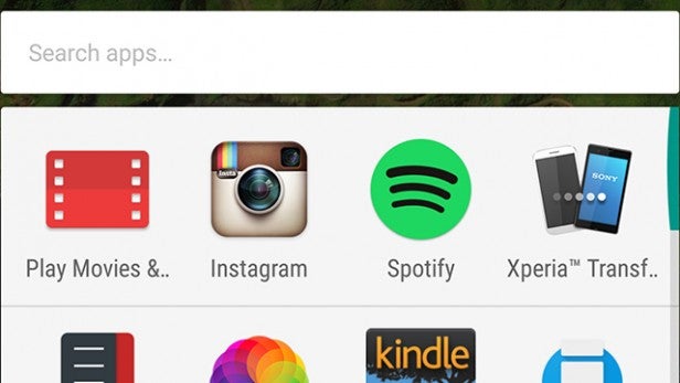
The biggest change this time around is the updated Google Now Launcher. Instead of storing all your apps on separate pages, they’re now displayed in a scrollable list with a handy slider at the side that makes jumping to the bottom much easier than before.

Along the top, four newly installed, updated or frequently used apps are given priority. I’d like this to be a bit smarter and throw up music-related stuff when you plug in headphones, for example. Google’s even added a search bar, which will explore across both your installed apps and the Play Store.
Each of these changes is for the better, rather than having a whiff of change for changes sake – iOS 9 multitasking switcher, anyone? Apps are far easier to find, and I appreciate the ability to search and head straight to the Play Store. Interestingly, the new launcher isn’t exclusive to Marshmallow, you can grab it for any Android device running 4.4 and higher.
Changes to the lockscreen are minor – there’s now a bolder font for the clock, and the phone icon in the bottom left has been replaced by a microphone. This makes sense, as you can jump right into shooting off a voice command.

Sadly, the system-wide dark mode from the preview builds didn’t make the final cut, but a handy UI tuner has. This lets you alter the settings featured in the notifications panel, but there are only a couple of options and limited customisation on offer. Still, it’s nice to have.
It’s a shame, then, that Android apps in general aren’t as good-looking as their Google-made counterparts.
Also disappointing is that Google still struggles to make Android tablets anywhere near as productive as its Windows and iPad rivals. There’s no split-screen multitasking, no pop-out video players, and hardly any visual improvements to make the most of the bigger canvas.
This is even more baffling as Google is looking to take on the Surface Pro and iPad Pro with the Pixel C. The first non-Nexus tablet from Google could be a complete dud on arrival if such features aren’t seriously beefed up before launch.
How we test phones
We test every mobile phone we review thoroughly. We use industry standard tests to compare features properly and we use the phone as our main device over the review period. We’ll always tell you what we find and we never, ever, accept money to review a product.


