Fast Charge: Are a smartphone’s looks as important as its specs?

OPINION: It’s clear that a smartphone’s appearance counts for a lot. But would you be willing to overlook some spec deficiencies for a good-looking handset?
When you’re buying a smartphone, there are a lot of qualities that you have to consider all at once in order to determine which one is right for you.
Do you want a large battery that will last you through a day and then some? Do you want the best possible camera, so that you can capture meaningful moments? Do you want a perfectly sharp and bright screen, so that your chosen entertainment looks better than ever?
However, one factor that perhaps isn’t always considered to quite the same extent as those above is the design of the phone itself. Partly, this could be due to the fact that there is no objective measurement for such a thing; while we can judge screens for their pixels, their refresh rate, and their nits, there’s no way to declare authoritatively that one design is better than the other.
Nonetheless, a product’s immediate appearance can actually have the most lasting impact on your impression of it.
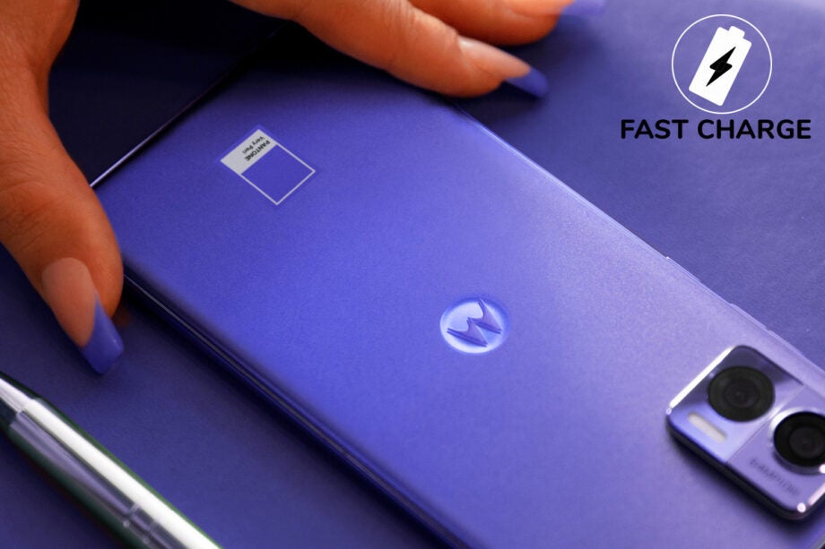
In a chat with Motorola and Pantone, I discussed the recent partnership that had formed between the two brands. Explaining this unique collaboration between a smartphone manufacturer and a colour expert, representatives of the two revealed to me just how important colour and design could be when choosing a new phone, or any product for that matter. One of the most eye-opening statistics Motorola shared with me was that the colour of a device factors into 80% of purchase decisions, even when the customer puts a case on the phone afterwards.
It’s incredible to think that an aspect of a device which is technically superfluous could have such an immense influence on what you buy, and yet it’s all too believable.
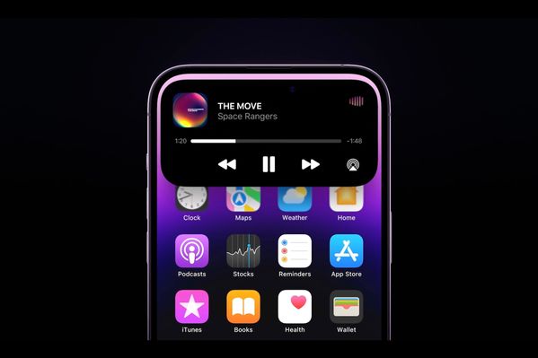
To take another recent example, at Apple’s Far Out launch event, the most impressive announcement for most viewers, judging by the impact on social media, was not the improvements to the camera or the processor of the new iPhone 14 Pro, as astonishing as those were, but rather the new “Dynamic Island” at the top of the screen.

If ever there was a company that recognised the fundamental importance of design to a product, it would surely be Apple, which owes so much to the likes of Steve Jobs and Jony Ive. And so while Android manufacturers had long replaced notches with cut-out cameras at the top of the screen, Apple has bided its time until finding an ingenious and attractive solution in the form of this pill-shaped cut-out which expands and contracts when showing widgets, almost seeming to dance at the top of your screen.
Not only does this new feature look good and offer some (limited) functionality, but most of all it’s distinctive and inimitable; you’ll be able to tell at a glance whether someone has got the latest and greatest iPhone, and that exclusivity is something people will no doubt be happy to pay for.
Whether we’re talking about well-chosen colours or innovative new looks, it’s clear that even subtle design decisions have a great impact on how we perceive and appreciate our handsets, and can add some novelty value or genuine excitement to our everyday experiences with smartphones.
While we may like to think of ourselves as being entirely rational, choosing products that have the best all-round performance, it’s clear that the subconscious attraction of a good-looking handset is often the key factor that shapes our buying decision. With the smartphone market as saturated as it is right now, looking different could be the way to stand out from the pack even beyond the usual arms race of camera and screen specifications.


