Can Motorola show its true colours with the help of Pantone?

Motorola and Pantone are two very big names in their respective fields; the former produces top-selling and highly-rated smartphones, while the latter is a leading source of colour expertise.
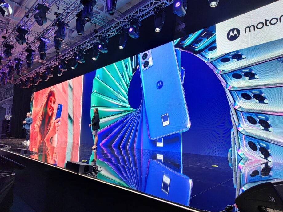
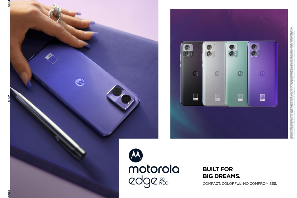
The partnership between the two will see Motorola seeking Pantone’s advice on colours in its products, and this was first in evidence at the launch of the Motorola Edge 30 Neo; this handset is available in four Pantone colours (Ice Palace, Aqua Foam, Black Onyx, and Very Peri – Pantone’s Colour of the Year for 2022), and each of these is physically displayed as a branded swatch on the back of the device.
While we may be used to seeing some brand partnerships with smartphone manufacturers, particularly around the camera – such as Hasselblad with Oppo, or Huawei with Leica – this colour partnership seems a unique and unprecedented one.
So, how did it come about?
Ruben Castano frames it as one part of a desire to “quantify elements that go into product design. When researching design elements such as size, weight, and feel in the hand, research is always the most important.” This partnership, then, helps Motorola to “search for reliable data on colour – and how it becomes a universal language of expression. Pantone is uniquely positioned to do this thanks to its vast network of trendsetters and researchers, who have an understanding of how colour works for consumers.”
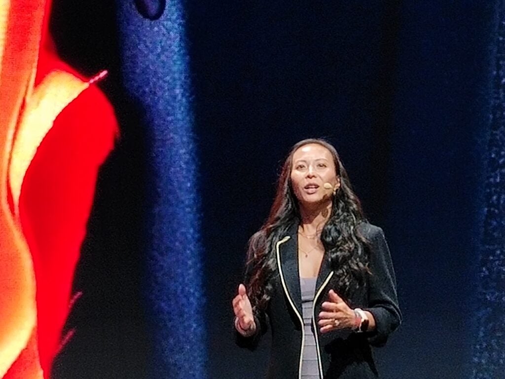
Elley Cheng adds that this collaboration is part of a shared vision between the two brands. While “Pantone has been in the colour business for decades… there are different experiences across different media.” Motorola, being “innovative and tech forward, can infuse this colour element into their design in a way that showcases the power of colour.” Such a collaboration, she suggests, “takes innovative thinking – that Motorola obviously has. They also make products that help the user to express themselves.”
Why is now the right moment to introduce this new initiative?
Ruben claims that the timing is right because of the position that smartphones now occupy in our daily lives; “it is a common device but also a very personal device – the phone is a personal extension of themselves, a statement of expression. Personalisation is sought in many different ways, and self expression can be found in the digital and well as just in the physical. That’s why we’re taking this seriously, to connect with our customers.”
Elley adds: “Colour has long been taken for granted, and it’s only recently that we have talked about colours being represented accurately on screens, for when we want to experience everything a lot more immersively on screen.” She puts it that this appreciation of colour should remain “when you walk into the physical world.”
The theme of self-expression is one that both Ruben and Elley refer back to regularly; evidently, this is a key part of Motorola’s brand strategy going forward – even to the point of Ruben saying it was “not about trying to sell more phones, but about both brands growing their stories.”
But how does this connection work in practice; were there any challenges along the way, and in particular when constructing the new devices themselves, which rely not just on their appearance but also in their physical dimensions and their specifications?
Ruben, speaking for Motorola’s experience, remarks that “Pantone dedicated a team to this project, including experts in trends and research of colours, who also brought their past experiences from the fashion world.” He notes that it took “empathy and affinity to get on the same level as their design team.”
“Pantone is focused on colour”, says Elley, “but we also feel that other senses help you to see and process colour. If you’re only seeing colour in one particular instance, then you’re not getting the full picture. We want you to get the full sense of emotion from a colour.”
It seems that the two brands have learned a lot from each other during this process. Ruben says that “Pantone came to the table and brought a wealth of information on consumer trends, social trends, and it translates those trends into themes and colour stories.”
Elley, speaking on Pantone’s new experience in the world of tech, underlines that “It’s great to see how different audiences and consumers react with different interactions with colours. Personalities are different, experiences are different, and a phone can be very intimate; it ranges to everything, from fashion to a piece of furniture. Consumers react very strongly, and very dynamically to it.”
There’s one particular design element which is of course a striking reminder of the collaboration, and that’s the colour swatch on the back of the Edge 30 Neo. Smiling, Elley says that this decision simply “seemed right, and was fun for both sides”, while Ruben concurs, adding that “this iconic element was an elegant way to sign the product – it’s a signature of the collaboration.”
However, there does seem to be one potential issue with this focus on colour – will consumers will simply put a case on their phones, covering up the rear panel?
Ruben actually gives me a surprising answer: “Motorola has a wealth of research which shows that customers do want to protect the purchase, but before the purchase the colour is very influential – over 80% of purchase decisions are influenced by the colour. Consumers want to make it feel like a personal choice.”
During our talk, both interviewees have been keen to underline both the depth of this partnership and also the fact they want it to be long-term. So what does the future hold?
While the Neo is “the launch vehicle, and the start of the story”, Ruben discloses that Motorola’s “entire portfolio is being done as a collaboration”, so we can expect to see far more input from the brand – and it’s not just limited to colours on the back of the devices. He is also keen to claim that Motorola’s UI is the “most pure Android experience available, giving consumers the ability to personalise the device to their own liking with colours, highlights, themes, and so on.”
The future of this partnership is an interesting prospect for Motorola
Again he states that this is “only the beginning”, so perhaps we can hope for more Pantone integration in this space further down the line; however, when pressing Ruben for any specific examples of upcoming products, he politely reminds me that he can’t comment on future devices.
The future is indeed an interesting prospect for Motorola, with the brand eyeing up a new direction towards capturing a different, more expressive audience; this partnership is just one factor in that process. Having spoken earlier with Francois LaFlamme, Motorola’s Chief Global Marketing and Strategy Officer, I noticed the number of times he used the word ‘provocative’ when discussing this shift in focus, so I put this word to Elley and Ruben for their opinions.
In the context of the Pantone partnership, Elley interprets it as a way to raise topics for discussion: “this is not about us creating something out of nowhere, but about how we perceive what’s going on around the world. Colour is a visual adjective that compels you to ask: ‘How does this make me feel?’.” For example, at the launch event she noted that the Aqua Foam colour had a calming effect for her, which may help to ameliorate any stress from the messages or reminders that might pop up on her phone. Ruben agrees with this angle, not seeking to address issues that are “extraneous to the market” but wishing for the new colours to “strike a conversation with consumers.”
From my time with Ruben and Elley, it’s clear to see that there’s been a lot of consideration and thought put into how these two brands can interact both with each other and with the consumer. The focus on colour as a key aspect of the phone’s design is an interesting and seemingly novel one, and it could well prove to be a key distinguishing feature from the rest of the market.
In the limited time I’ve spent with the Motorola Edge 30 Neo, I’ve certainly been struck by its bright and bold Very Peri colour, but it’s important to note that the attention to design goes beyond just that; it’s very thin and lightweight to hold in the hand, there’s a handy notification light around the camera module, and the software is indeed refreshingly simple.
There’s a lot more to a smartphone than just its colour or design of course, but these elements do undeniably have a large impact on how the consumer perceives the device. Though only in the early days of this partnership, Motorola and Pantone seem confident that they can build on the intrinsic relationship between colour and emotion to reshape the way we think about our smartphones, and I’m looking forward to seeing the next steps in this journey.
You might like…


Editorial independence
Editorial independence means being able to give an unbiased verdict about a product or company, with the avoidance of conflicts of interest. To ensure this is possible, every member of the editorial staff follows a clear code of conduct.
Professional conduct
We also expect our journalists to follow clear ethical standards in their work. Our staff members must strive for honesty and accuracy in everything they do. We follow the IPSO Editors’ code of practice to underpin these standards.