

Google Drive on the web has been treated to a facelift, which brings the productivity service in line with the redesigned Gmail.
The search giant hasn’t added any new functionality, but says it made the changes in order to align Drive with its “latest material design principles” (which you’ll find here).
Related: New Gmail
The result is a cleaner, brighter, more modern-looking product, but at the same time, the visual tweaks aren’t so dramatic that you’ll have to learn how to navigate Drive all over again.
“We built… this new interface to create a responsive and efficient experience for Drive users, and to feel cohesive with other G Suite products, such as the recently redesigned Gmail,” the company said in a blog post.
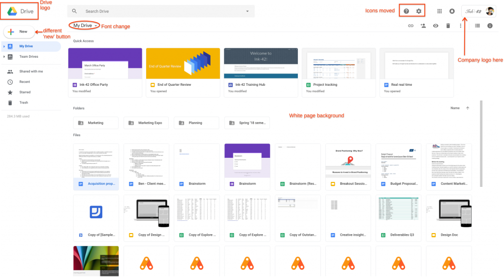
The biggest changes are as follows:
- The Drive logo now appears in the top-left corner
- If you’ve added a custom company logo, it is now displayed in the top-right corner
- The Settings icon and Help Centre icon now sit level with the search bar
- The page background is now white, not grey
- The “New” button is larger and rounded
- The font used for headers has been changed
Read more: Google I/O 2018
The new version of Google Drive should roll out to all users within the next two weeks.
What do you think of the changes? Share your thoughts with us on Twitter @TrustedReviews.
Editorial independence
Editorial independence means being able to give an unbiased verdict about a product or company, with the avoidance of conflicts of interest. To ensure this is possible, every member of the editorial staff follows a clear code of conduct.
Professional conduct
We also expect our journalists to follow clear ethical standards in their work. Our staff members must strive for honesty and accuracy in everything they do. We follow the IPSO Editors’ code of practice to underpin these standards.