Netflix is testing a brand new version of its browser site that’s likely to exponentially improve the user experience and the ability to find content quickly.
The new Netflix.com portal, currently showing for a limited number of test subjects (via The Verge), abandons the frustrating and slow-moving carousel in favour of larger thumbnails and a darker design similar to the company’s mobile apps.
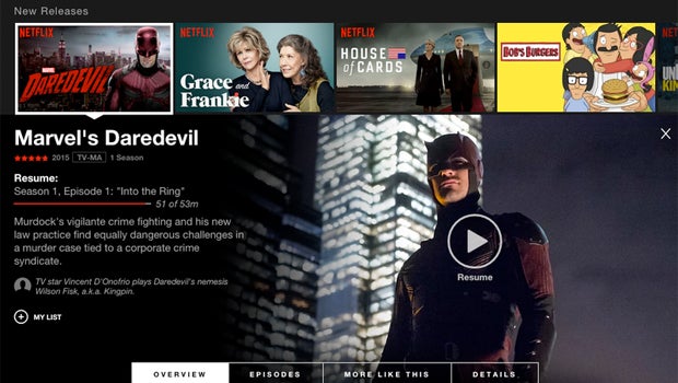
Now, instead of hovering over thumbnails in order to see a play button and little else of use, Netflix fans can now click a thumbnail to see an expanded view complete with a list of episodes.
Read more: Opinion: Netflix should steer clear of Clarkson
The current iteration makes it very difficult to find individual episodes without leaving the homepage or beginning playback. The new design will solve that problem if and when it rolls out to the wider community.
As well as a list of episodes, the new drop-drown screen will also feature cast, run time and run time information.

(Above: The current Netflix browser site)
Netflix hasn’t confirmed when the mobile-inspired UI redesign will roll out to all users, but judging by today’s reports it’s ready for prime time and will be with the masses sooner rather than later.
While many use Netflix through the firm’s mobile and Smart TV apps these days, it’s good to know the streaming pioneer hasn’t forgotten about its website, which was certainly in need of a revamp.
We’ll let you know when the firm extends the hassle-free redesign to everyone. Until then, keep awkwardly scrolling, desktop users!

Editorial independence
Editorial independence means being able to give an unbiased verdict about a product or company, with the avoidance of conflicts of interest. To ensure this is possible, every member of the editorial staff follows a clear code of conduct.
Professional conduct
We also expect our journalists to follow clear ethical standards in their work. Our staff members must strive for honesty and accuracy in everything they do. We follow the IPSO Editors’ code of practice to underpin these standards.