Vivaldi users had better get ready to be taught a ‘History’ lesson in the new version of the browser.
Following the latest update, Vivaldi CEO Jon von Tetzchner explained in a blog post that users can now gain more insights than ever before from their browsing habits.
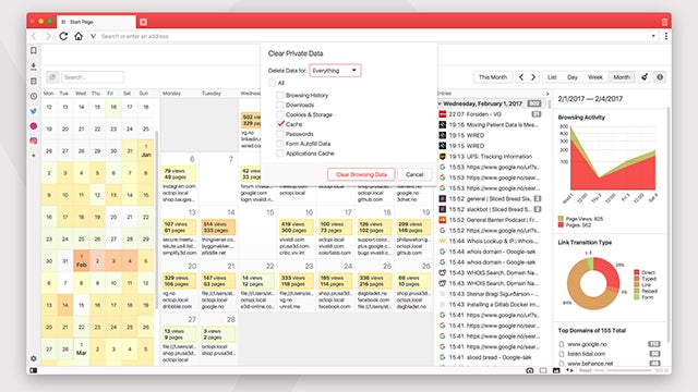
Improvements to the History tab basically mean that you can scan through your browsing data differently, including via various visual aids.
Instead of being sorted into a list, sites that you’ve visited are now assembled on a day-by-day calendar that shows top domains and volume of browsing for each day.
Related: Best browsers
The side bar is where the graphics live and the resulting graphs plot your activity, link transition types used (how you go to each site) and a list of the sites you visit the most.
“We want to make browsing history more useful than ever before. Instead of having to scroll through hundreds of lines, Vivaldi gives a comprehensive overview of history, presented in a visual way. This lets our users analyze their online activity and helps them find what they are looking for,” von Tetzchner added.
Vivaldi went on to reiterate that none of this data ever leaves your computer; it stays local to you, which is something that users are almost certainly more worried about than the colourful graphs the browser can produce.
When the browser was reviewed by our computing editor Michael Passingham last May, he gave it an overall score of 4/5 and called it a “superb browser for power users”. If that’s you, then we recommend giving it a try.
Watch: Laptop buying guide
What’s your browser of choice and why? Let us know in the comments section below.
Editorial independence
Editorial independence means being able to give an unbiased verdict about a product or company, with the avoidance of conflicts of interest. To ensure this is possible, every member of the editorial staff follows a clear code of conduct.
Professional conduct
We also expect our journalists to follow clear ethical standards in their work. Our staff members must strive for honesty and accuracy in everything they do. We follow the IPSO Editors’ code of practice to underpin these standards.