Verdict
The first thing you’ll notice about WebOS, aside from the charming way it rounds off the corners of the screen to reflect the curve design of its handsets, is it doesn’t offer a number of homescreens full of shortcuts and widgets. Instead there are just five shortcuts to the Dialler, Contacts, Email, Calendar, and app Launcher, across the bottom of the screen and the rest of the screen is left to show whatever wallpaper you’ve chosen. It’s only once you start using some apps that that space fills up.
When an app is open, it fills the whole screen, just as on any other OS, but flick your finger upwards from the bottom of the screen and the app is minimised to a ‘card’ which then sits on the homescreen. Open another app and ‘minimise’ it and it similarly turns into a card and lines up alongside the other app. Like this you can open up over 100 apps at once and very simply slip and slide between them – the cards even show what’s happening in the app. Flick a card upwards and off the screen and it closes the app.
New to WebOS 2.0 is the ability to stack these cards one on top of the other to more easily keep them organised and navigate them. This makes a big difference to usability and takes what was already the best multitasking interface to another level – if you’re someone that finds themselves with many, many apps open at once you should seriously consider a WebOS device. 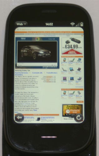
Another key to WebOS is its gestures. Instead of integrating back and forwards actions into the onscreen controls, you use a touch sensitive area below the screen to swipe backwards and forwards. You can also tap the area to bring an app to the fore or tap it again to turn it back into a card. This gives the interface a nice uniformity and saves the space onscreen controls would otherwise have taken up. 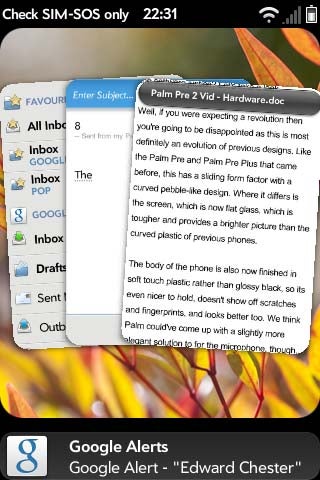
Other niceties include the way notifications are displayed. They appear along the bottom of the screen, while the content of the rest of the screen moves upwards to fit them in, meaning you can easily see what’s new while still doing what you were doing. If you’re using an app with a full screen option – like the video player – then these notifications are hidden as are the rounded corners of the screen.
Another new feature for WebOS 2 is Just Type. Open the phone up and start typing or start typing when no app is active and a search box will appear and below it will instantly start appearing matching contacts, calendar entries and apps. Below this you can also tap for matching emails, bookmarks and browser history. The best bits are two new additions called Launch & Search and Quick Actions. 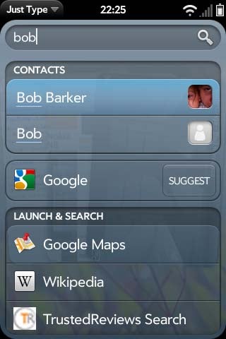
Launch & Search is an utterly brilliant addition. It basically provides shortcuts to online search engines, enabling you to quickly search google or Wikipedia, say, for the words you just typed. What makes it utterly brilliant, though, is that you can add the search functions of any other site. Simply navigate to any website that has a search box and the web browser will detect it and ask if you’d like to add the search function. Now just go back to the homescreen, start typing and you’ll see that a link to the website has appeared. Tap it once and you’ve instantly searched the website for what you just typed. It’s is utterly brilliant and works with our very own search engine!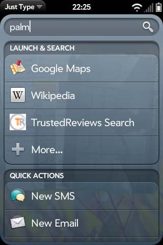
As for Quick Actions, they give you one touch access to starting an email, SMS, or Facebook status update with the words you’ve just typed.
What makes both of these functions, and the whole Just Type interface, so great is that they’re fully customisable and open for developers. So you in theory you can have Quick Actions for Twitter, or even your blog, and search functions for all your favourite websites, and you can have the options appear ahead of the other options in Just Type if you so wish. 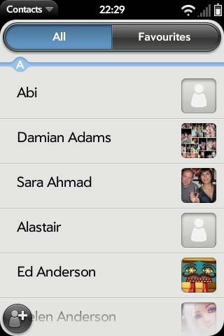
This open integration of other features is a theme that runs throughout the OS. From contacts and email to the web browser and media players, it’s all open and ready for third parties to tie into. It is up to third parties to use this facility but potentially you can have all the key functions of the phone integrate seamlessly with all your favourite online services. So if another new social network becomes the in-thing then you won’t have to wait for Palm to integrate support into its next firmware, the designers of the new service can develop it themselves. All this is in contrast to most other alternatives that have limited support for the big social networks – most notably Facebook – but aren’t necessarily open to others.
Going back to the problem of having no apps or widgets on the homescreen, on previous versions of WebOS this was particularly annoying as, once you opened the app launcher (bottom right icon) the apps were arranged in a fixed manner, so if your favourite app wasn’t on the first page, tough luck. New to WebOS 2.0 is the ability to rearrange your apps and add or remove pages, giving you more freedom to access your favourite apps quickly. There’s still no provision for widgets though. 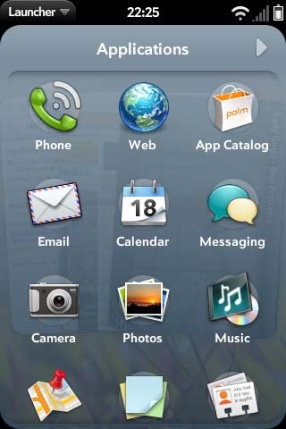
The other key improvement for the overall interface is simply speed. While the improvements in the (lijnkout:https://www.trustedreviews.com/mobile-phones/review/2010/11/30/Palm-Pre-2-Review/p1 Palm Pre 2), that we’re testing the OS on, are largely due to it having a CPU twice the speed of previous versions, the new OS also helps out. This is because it now supports GPU acceleration, which helps all those slick graphically rich menu transitions and such like run smoothly.
Key to the WebOS experience is integration of information from multiple sources and this is probably most noticeable in your contacts where after adding Facebook, Palm, Exchange and other email accounts you will find your contacts bursting with addresses, pictures and other bits of information. 
If you end up with multiple entries for each contact, it’s a simple task to link them together into one super contact from which you can access all their information. Sadly selecting a contact doesn’t actually show the messages they’ve sent or the Facebook updates they’ve made, nor does clicking the Facebook icon on their profile actually go to Facebook. So while social networking integration is there, it’s not quite on the level of some rivals. 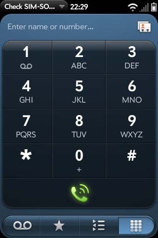
The dialler is a simple enough affair with nice large buttons and quick access to contacts, call history, favourites, and voicemail. The presence of an onscreen keypad does rather highlight how it surely can’t be that difficult to add an equivalent option across the rest of the phone. 
Text messages are handled as smartly as we’ve come to expect nowadays with texts exchanged with one contact arranged together into a conversation. Tap the button at the top of the screen and you can access your IM buddies, indeed IMs and SMS texts are nested into the same conversation. Sadly Windows Live! Messenger isn’t supported.
All the usual options are available for email with IMAP, POP3 and Exchange accounts supported. All your emails can be gathered into a single inbox for quick viewing and, rather conveniently, if you go back a step the folders for each account are displayed below the main inboxes for each account, giving you instant access to the specific folder you’re looking for, without having to go back and forth between accounts, as on the iPhone for instance. There isn’t, however, and threaded message support. 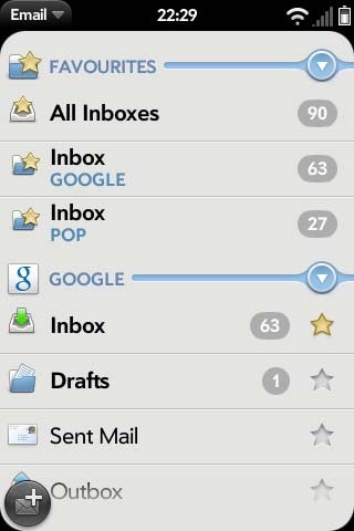
Start a new message and it’s quick and easy to choose which account you’re sending it from, search for a recipients, and attach documents, photos, music, or videos. Typing out your message is helped by a decent typing engine with adequate predictive text support. You can also define shortcuts whereby tapping a couple of letters will result in a whole word being spelt out. Sadly there still isn’t support for onscreen keyboards so you’re stuck with physical ones as on the Palm Pre 2, which is decent but certainly not the best. 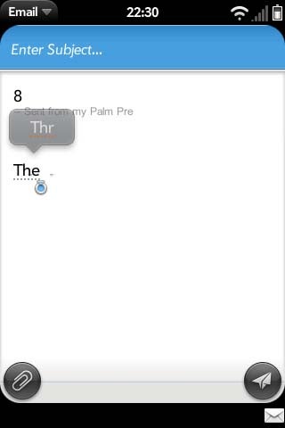
Text editing functions are also available though they’re not the easiest to use, requiring you to hold down shift while selecting text then pressing C while holding down a finger on the gesture zone to copy and holding down V with a finger on the gesture zone to paste. In fairness, it sounds more complicated than it actually is, though given our desire to have a fully touchscreen phone running WebOS, Palm will have to come up with an alternative method for such situations. 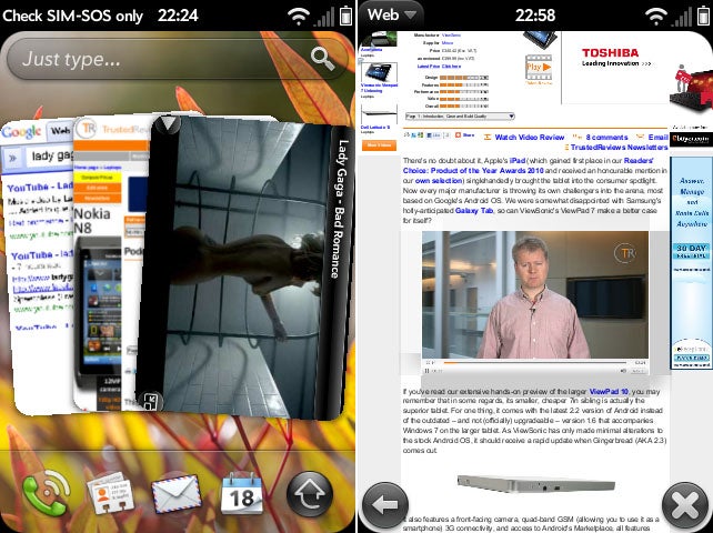
The web browser is excellent – one of the best available – with rapid, accurate rendering of all the webpages we tried. Pinch to zoom is on offer as is support for Flash video, which is handled very neatly – tap a flash element and it selects it, locking the screen to it, making it easier to navigate within the app. You can then turn the screen to landscape mode and the element will automatically fill the screen. Tap the cross to exit the element and you can resize and navigate the screen as per usual.
Unlike many rival devices, you can simply drag and drop your media files onto a WebOS device, and the phone will automatically arrange them into folders and albums. 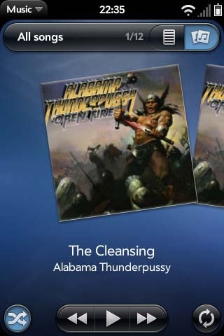
The music player is a neat and simple affair that gets the job done with aplomb. It’s really easy to navigate through your tunes and it has some useful features like a Shuffle All button on the first screen when you open the app. When you minimise it while a song is playing, a small musical note icon appears in the bottom right corner giving you access to basic controls. 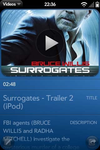
The video player is very basic in terms of interface but gets the job done. It supports MPEG4, H.264 and H.263 playback and despite the Palm Pre 2’s small screen it looks great and runs smoothly. A dedicated YouTube app is on hand for online footage and it’s very nice to use.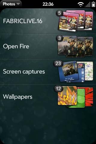
Picture viewing is done through a simple app that displays folders of images in a list then the images themselves in a grid. Open one image and you can smoothly swipe left and right to the rest. You can also add accounts to the interface (currently Facebook and PhotoBucket) for uploading straight from the photo viewer.
GoogleMaps is included and it works just as well as on the iPhone and Android, though it lacks the former’s smooth transitions when zooming in and out. Directions are supported, though the interface isn’t quite as slick as some alternatives with no support for zooming in on the map and following you as you go along. 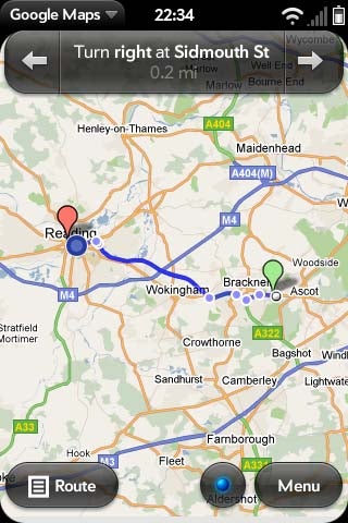
QuickOffice and PDF View are onboard ready for reading, though not editing, documents while all the usual apps for Memos, Clock, Tasks and Calculator are also available. 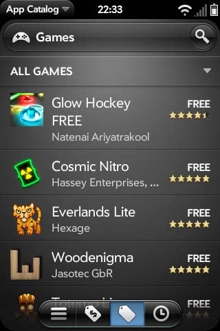
Delving into the App Catalog reveals a rather spartan selection, which isn’t helped by a slightly unintuitive interface – the icons along the bottom are particularly perplexing. Some basics like Twitter aren’t represented by official apps, though there are plenty of 3rd party alternatives. Likewise, most general utilities are available. Games support is also improving thanks to better hardware support in the OS. Angry Birds is the headline new addition at the moment and it does indeed work very well and is just as much fun as on any other device. There’s no escaping the fact that WebOS seriously trails in the competition in this area currently, though. 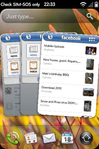
One highlight, however, is the Facebook app, which is simply the best on the market right now. You can open each part of the app – the news feed, picture viewer etc – in a separate card and easily flip between them all. You can also apply filters to the news feed and the whole thing is just beautifully presented.
”’Verdict”’
WebOS was always an impressively slick operating system and it remains ahead of most of the competition in terms of sheer enjoyment to use. This is now also backed up by rapid performance and a wealth of features that again puts it at least on par with the rest. Certainly if you’re after a phone with the elegance and slickness of the iPhone and Windows Phone 7 but want something a bit more open, adaptable and capable, then it’s well worth considering. However, currently it does trail in terms of app support and most damning of all is it’s only available on the Palm Pre 2, which is an okay phone but really should be better.
Trusted Score
Editorial independence
Editorial independence means being able to give an unbiased verdict about a product or company, with the avoidance of conflicts of interest. To ensure this is possible, every member of the editorial staff follows a clear code of conduct.
Professional conduct
We also expect our journalists to follow clear ethical standards in their work. Our staff members must strive for honesty and accuracy in everything they do. We follow the IPSO Editors’ code of practice to underpin these standards.