Sections
- Page 1 Philips 40PFT5509 Review
- Page 2 Picture Quality Review
- Page 3 Sound and Conclusions Review
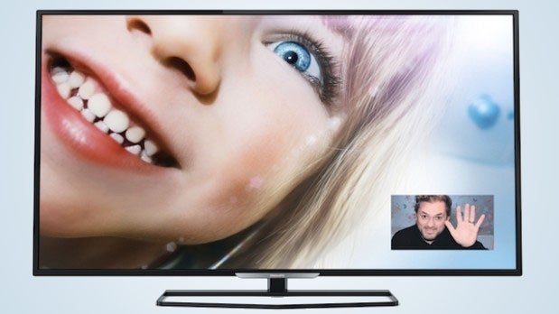
When you’re talking about the sub-£450 price bracket for 40-inch TVs you’re generally talking about a race to the bottom in picture quality terms. But while there are inevitably signs of corner cutting, the 40PFT5509’s picture quality comfortably outperforms expectations.
The main reason for this is that its black level response is miles better than that of most similarly affordable rivals. Using most of the picture presets – we personally settled on a modified version of the Standard setting for most of our viewing – dark scenes and dark parts of pictures betray strikingly little sign of the grey mist problem so common on affordable LCD TVs. Nor is there any significant blue or green overtone to dark content.
Making this all the more impressive is the way such impressively rich and believable black colours – which find the black bars above and below 2.35:1-ratio films looking admirably close to the deep blackness of the screen frame – are delivered without the screen having to work too hard.
In other words, if you follow our set up guidance the dynamic contrast system doesn’t cause horrible jumps in the image’s overall light level; dark areas retain decent amounts of shadow detail; and bright parts of predominantly dark scenes still look bright and punchy, showing the screen isn’t having to remove too much overall light in its bid to produce a convincing black colour.
 Also impressive for the most part is the 40PFT5509’s backlight uniformity. For despite its knack of keeping dark scenes looking dynamic and contrast-rich without compromising black level depth, there’s only minimal evidence of backlight clouding or inconsistencies.
A jet of surplus light can be seen protruding into the top left corner from time to time, but if you follow our contrast and brightness set up advice this only very rarely becomes a distraction.
Its impressive black level response helps the 40PFT5509 produce a wider colourscape, too. Tones across the colour spectrum look exceptionally bold and vibrant for the cheap end of the TV market, and better still this boldness is delivered without making tones – even skin tones – look over-wrought or otherwise unnatural.
There’s enough finesse in the 40PFT5509’s palette, too, to ensure that blends never look stripey or patchy.
Philips TVs have long displayed an obsession with sharpness. And this seems borne out again by the 40PFT5509, which delivers HD with a clarity, sharpness, texture and pixel density that feels like it should belong to a much costlier TV.
What’s more, this almost ‘beyond HD’ feel is achieved without pushing grain too strongly or leaving edges looking over-sharpened or ghosty.
The clarity does diminish a little when the image contains fast motion, but actually the degree to which this happens is quite limited by cheap 40-inch TV standards.
As, in fact, is the amount of judder, which is surprisingly minimal considering the image doesn’t suffer with any noticeable motion processing artefacts/glitches.
Some more expensive TVs than the 40PFT5509 can deliver more finesse in the colour department, more clarity with motion, more brightness without compromising black levels, and more shadow detail in dark areas.
But there are also plenty of more expensive TVs out there that fall short of this impressive Philips model in one or more of these key areas, making their pictures feel less immersive and cohesive.
How we test televisions
We test every TV we review thoroughly over an extended period of time. We use industry standard tests to compare features properly. We’ll always tell you what we find. We never, ever, accept money to review a product.

Editorial independence
Editorial independence means being able to give an unbiased verdict about a product or company, with the avoidance of conflicts of interest. To ensure this is possible, every member of the editorial staff follows a clear code of conduct.
Professional conduct
We also expect our journalists to follow clear ethical standards in their work. Our staff members must strive for honesty and accuracy in everything they do. We follow the IPSO Editors’ code of practice to underpin these standards.