Nokia E7 Review
Nokia E7
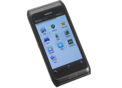
As beautifully built as ever but Nokia's flagship slider smartphone is fundamentally flawed, for now.
Verdict
Pros
- Beautiful design
- Incredibly well built
- Superb sliding keyboard
- Decent camera for non close-ups
Cons
- Slow interface
- Clunky, confusing interface
- Poor default app selection
- Fewer apps in app store than competition
Key Specifications
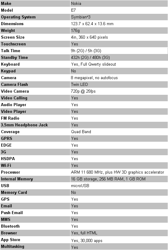
- Review Price: £499.00
- 4in AMOLED screen
- Large slideout keyboard
- Symbian 3.0 OS
- 680MHz processor
- 8 megapixel camera
Where the Nokia E7 doesn’t disappoint is in its styling and build quality. Crafted from great slabs of aluminium and a large glass screen, the only rivals that come close to equalling the general feeling of quality are those built by Apple, and even then it’s only really the iPhone 4 that competes. There’s an argument for saying that if dropped on a floor it would come out just as badly as countless others but as a device to handle it is exceptional. 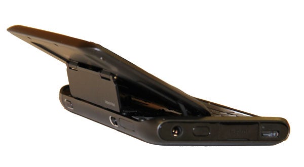
Slide the screen up to reveal the keyboard and this impression isn’t dull for a moment thanks to a strong slide mechanism and beautifully crafted and laid-out keyboard. However, the slide action itself is a bit awkward. While we appreciate that having the screen rise to a more readable angle is beneficial, it does mean you can’t deftly slide the phone open with one hand. Moreover, even two-handed the action is a bit fiddly and takes a little while to get the hang of without having the phone nearly fly from your hands.
Another immediate concern is the sheer bulk of the device. It’s surprisingly slim considering it’s packing a slide-out keyboard but the 4in screen and tough build combine to make this a hefty 176g beast with dimensions of 123.7 x 62.4 x 13.6mm (compared to 137g and 115.2 x 58.6 x 9.3 mm for the iPhone 4 – a phone that’s already fairly heavy).
As ever Nokia has packed the E7 with connectivity and buttons. Straight away we applaud the move to place the main menu button on the front in the middle rather than off to the side as on the N8, but elsewhere it’s a mixed bag. The power button on the top is tiny and recessed so is rather difficult to reach, while the slider switch on the left edge that locks and unlocks the screen feels superfluous. Yes, we appreciate some people find it useful but other buttons combine to perform the same function so it really isn’t necessary. Conversely we do rather like the volume slider on the right edge and greatly appreciate the dedicated button for the camera that’s also found here. 
Also to be found on the right edge is the SIM slot, which uses an, again beautifully made, metal tray to house the SIM. Finally up top are sockets for headphones, microUSB (for data transfer and charging) and HDMI, for piping video straight out to your TV. – not something we’d do all that often but useful nonetheless.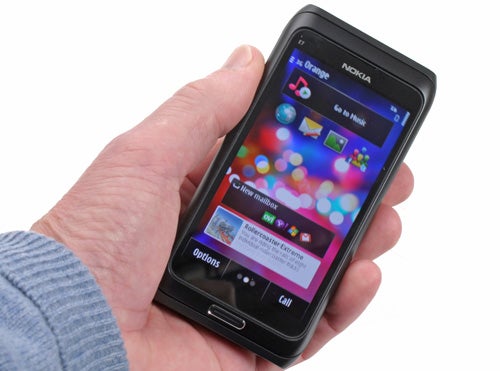
For watching video on the phone itself, the superb, bright and colourful AMOLED screen works wonders. Colours just leap from it while blacks really are black. It’s not quite perfect in that there’s a lot of blue colour shift when viewed from an angle but for general multimedia it’s a delight. For more precise work, however, like browsing the web or writing emails, the lower-than-average 360 x 640 resolution makes it a bit harder to see what’s going on.
All in all though, it’s a pretty good show so far. However, it’s when we come to the software that things break down.
Symbian had been Nokia’s OS of choice for years and it powered some great phones. However, with the explosion of touchscreen smartphones it has been slow to catch up. With Symbian^3, as used on this phone, things have improved but the overall experience is still cluttered and confusing. 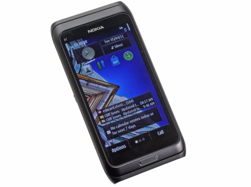
Like most alternatives, you’re presented with a number of homescreens onto which you can place shortcuts to apps, or add widgets. However, you can’t simply drag apps around willy nilly but must instead go through a whole host of menus to first add a shortcut widget then define the four shortcuts to go in that widget. What’s more, the widgets themselves, which also include things like quick email readers and social network feeds, can only be of a certain – too short – size and shape.
Even when setup to your liking, there’s a further oddity in that when you swipe across a homescreen to move to the next one, rather than smoothly following the motion of your finger, it waits until you’ve finished moving and then swaps the homescreens. It’s claimed this is an intentional usability decision as it means you don’t accidentally move your homescreens – bunkem! Anyone who has used an Android, Windows Phone or iPhone will tell you that such a thing never happens and that having the screen actually reflect what you’re doing is preferable. 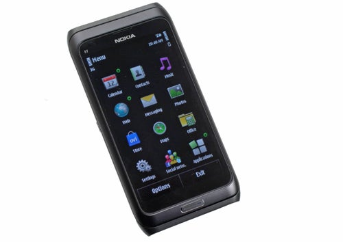
Further annoyances include the additional tap of the Applications folder required to access the majority of the phone’s apps from the main menu, when other platforms put them closer to your fingertips. Anything you’ve downloaded or that doesn’t come under the basic list of messaging, web, music and such like is squirreled away in this folder. Oh, you can add shortcuts to these apps on the homepage but the whole system just feels utterly backward and more than once we were left so frustrated setting the thing up we discarded it on the sofa to return to later when the rage had dissipated.
It’s a similar story when it comes to some of the specifics. Contacts, for instance, can’t be populated by simply logging into an email account and once presented they don’t include social network pictures and profile information. In fact, social networking in general is a bit of a bind to get to grips with. 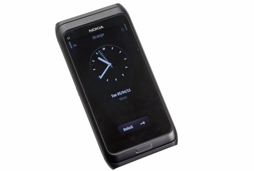
The web browser gets the basics done by successfully displaying full web pages but the interface is again appalling, and there’s no Flash video support. Thankfully you can download an alternative in the shape of Opera Mini from the Ovi app store, but in this day and age you really shouldn’t have to download an app to get such a basic level of usability.
The app store itself is also something of a minefield. The selection is somewhat sporadic and still doesn’t come anywhere near to rivaling that of Android of iOS – there simply isn’t the same level of choice. It’s getting better but it’s certainly not enough to save this phone.
There is one gem to this phone when it comes to software, and that’s Ovi maps, which is a completely free mapping and sat nav app that is easy to use and has good maps for a huge number of countries, all of which can be used without a mobile data connection (though this takes a bit of setting up).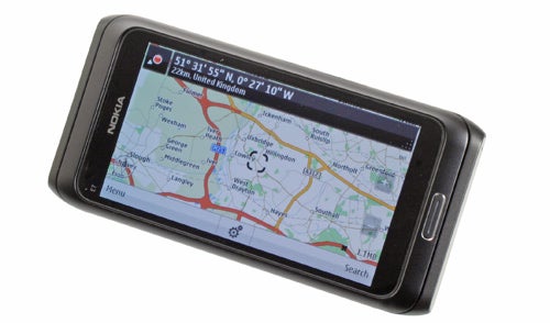
Of course, given its slide-out keyboard, one thing this phone should excel at is tapping out messages, and indeed that is the case. The layout and key feedback is excellent so we had no problems cranking up our typing speed. We still find the best on-screen keyboards can be faster but for those with large fingers or who just prefer a physical typing tool, you should the E7 more than capable. Which is just as well, as the onscreen 12 –button keypad-style keyboard is appalling.
Perhaps the most surprising thing about this phone is that it’s actually quite slow. A look at the specs might suggest this isn’t a shock given the device’s 680MHz processor, where most of its smartphone rivals use 1GHz chips. However, Symbian is usually a more efficient platform, requiring less powerful hardware to seem just as fast. Apparently, the E7 is pushing Symbian^3 to its limits though, as general navigation and particularly opening even seemingly undemanding apps results in significant pauses. 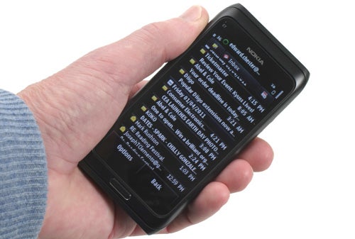
Taking photos also leads to disappointment. Instead of the sublime 12-megapixel shooter used on the N8, Nokia has equipped the E7 with an 8-megapixel unit. It’s not this step down that’s the problem, though – it’s actually the lack of autofocus. General snapshots of friends and scenery are fine, and indeed the quality’s a cut above, however any close-up shots are rendered blurry and unusable – for instance it’s no good for snapping a shot of a business card for use with the many business card reader apps now available. 
Thankfully the usual Nokia strong suits of call quality and battery life are on hand to give this phone a last hurrah. A noise-cancelling microphone and quality earpiece means calls are clear and natural sounding. The speakerphone isn’t amazing but is still good for its class. Battery life could actually have been better as well, as there’s only a 1200mAh cell used as compared to the 1400mAh+ units used in high-end alternatives, but thanks to the phone’s low power usage it still lasts a healthy 3+ days.
One last point to make before wrapping up is that Nokia has committed to updating Symbian for a little while yet, and an update announcement is expected next week. If that brings some much needed usability to the platform then the E7 starts to make much more sense, though even then we’d probably still opt for the N8 instead.
”’Verdict”’
There’s no two ways about it, the Nokia E7 just doesn’t cut it. The hardware is lovely with loads of luxurious metal, a great screen and superb keyboard. However, the software is a pig to use and is rather slow as well. Add in the silly slip up of having no autofocus on the camera and you have a phone that’s only worth considering if you’re a Nokia/Symbian/keyboard fan that simply can’t bear to change. Even then we’d probably opt for the Nokia N8.



How we test phones
We test every mobile phone we review thoroughly. We use industry standard tests to compare features properly and we use the phone as our main device over the review period. We’ll always tell you what we find and we never, ever, accept money to review a product.
Trusted Score
Score in detail
-
Performance 4
-
Design 8
-
Value 6
-
Features 7

