BlackBerry Z10 Review - BlackBerry 10 Review
BlackBerry 10
Does the BlackBerry Z10 do enough to put BlackBerry back on the map.
Sections
- Page 1 BlackBerry Z10 Review
- Page 2 Features and Screen Review
- Page 3 BlackBerry 10 Review
- Page 4 BlackBerry 10 continued Review
- Page 5 Calling and Messaging Review
- Page 6 Internet and Apps Review
- Page 7 Camera, Battery and Verdict Review
BlackBerry Z10 – BlackBerry 10 Interface
First impressions of the BlackBerry 10 interface are pretty good. There’s a slick guide that explains all the key gestures and eases you through the setup of some of the key apps. It also looks smart and feels responsive. However, once passed this initial setup there’s quite a steep learning curve before you get the hang of the intriguingly different way the whole interface works.
You see, BlackBerry 10 is highly gesture-based and centres around not one, not two but three key sections that make up the ‘homescreens’ of its interface. You get to each bit of the interface by swiping left or right from the edge of the screen.
Central of these is the multi-tasking panel, which as its name suggests, is where running apps are shown. It can show up to four apps on screen at a time with more if you scroll down, and they’re arranged in the order of when you last used them.
To the left of this is the BlackBerry Hub which is like the Messages app of old BlackBerrys and it holds a stream of updates and messages from email, SMS, social networks and more, giving you a one-stop shop for all your phone’s notifications.
The third parts of the homescreen arrangement are the pages of apps which are stacked to the right of the multi-tasking panel, with more and more pages added as you add more apps, just like on iPhone. 

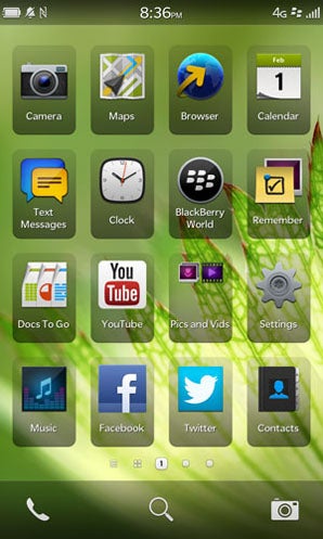
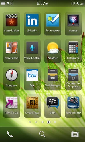

The key point of confusion in all this is that it’s the multi-tasking panel that is the centre of this BlackBerry 10 universe, with it being the place you end up when apps are closed (by swiping up from the bottom edge of the screen). This goes against all other major phone operating systems which instead present you with some sort of customisable homepage when you close an app – on iPhones you have your first page of apps, on Android your central page of apps and widgets and on Windows Phone 8 there’s the top of the Live Tile column. And so far, we’ve not found this new BlackBerry 10 way to be an improvement.
The problem is two fold. For one, the entire logic of assuming that every time you close an app (or unlock the phone for that matter) you’re going to want to open one of the apps you’ve previously had open is one we simply don’t agree with. By all means there’s a chance that if the phone’s been up and running long enough it will have most of your frequently used apps already available in this list but knowing where they’re going to appear in the list of open apps is complete guess work (unless you’re particularly adept at remembering the exact order you open and close your apps). That’s why all the alternatives choose to present a ‘normal’ homescreen – because it grounds the user, giving them a familiar place with all their favourite apps/contacts/websites/widgets to start each time they close an app. 
By all means, multi-tasking is useful but there’s a reason that on other phones this functionality is a second tier action activated by a second button or a double tap – a double tap on the iPhone, a second button on Android, hold down the back button in Windows Phone 8 – it’s not because they haven’t thought of it yet, it just makes more sense.
The other reason the multi-tasking panel is particularly grating to us is that is doesn’t use the icons of the apps, instead is uses screenshots of the app with the name of the app underneath. It’s certainly nice to have a bit of screenshot as a reminder of what you were last doing but at a glance it’s not the best way to distinguish between apps. After all, that’s what icons were invented for, to create an easily distinguishable way of identifying things on a computer. That’s why they’re used in the app pages of this and every other phone OS and that’s why they should be used in the multi-tasking panel.
You may think we’re just stuck in our ways or over-reacting but we’ve genuinely tried to get the hang of this way of doing things and for us it just doesn’t work, which is a shame because there is plenty to like about this OS, such as the BlackBerry Hub.
BlackBerry Z10 – BlackBerry Peek and BlackBerry Hub
The third part of the core BlackBerry 10 experience is the BlackBerry Hub. As mentioned above, it’s the store for all your phone’s messages and other notifications, but rather than just have this as a regular app BlackBerry has made it integral to the interface. 
From the homescreen multi-tasking panel you simply swipe from left to right to slide it into view but – and here’s the clever bit – when in an app you can also access the Hub by swiping up from the bottom edge of the screen and sliding to the right. You can either slide it all the way across to open the Hub fully or use what BlackBerry calls BlackBerry Peek to just take a quick look at the list of notifications to check who that latest email or text message was from, or what the subject was, then reverse the gesture to go back to what you were doing without even pausing the app.

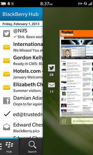
BlackBerry Peek also touches on another core principle of BlackBerry’s approach with BlackBerry 10. Instead of having permanent navigation buttons along the button of the screen or time and other status icons along the top, BlackBerry 10 allows apps to truly fill the entire screen. This is great for making the most of the screen space on offer, but of course it means you can’t quickly check things like the time. That’s where Peek comes in again as that quick gesture will not only show the Hub but the top section too (which shows, battery, signal strength, time, etc). It really is a brilliant system.
How we test phones
We test every mobile phone we review thoroughly. We use industry standard tests to compare features properly and we use the phone as our main device over the review period. We’ll always tell you what we find and we never, ever, accept money to review a product.

