Windows 95 to Windows 10: How the Start Menu has evolved
We’re pretty happy with Windows 10. It’s everything Windows 8 wasn’t, which is what was needed. One of the key reasons is the return of the Start Menu, and we think this is the best version of it ever. Here’s how it’s evolved over the years…
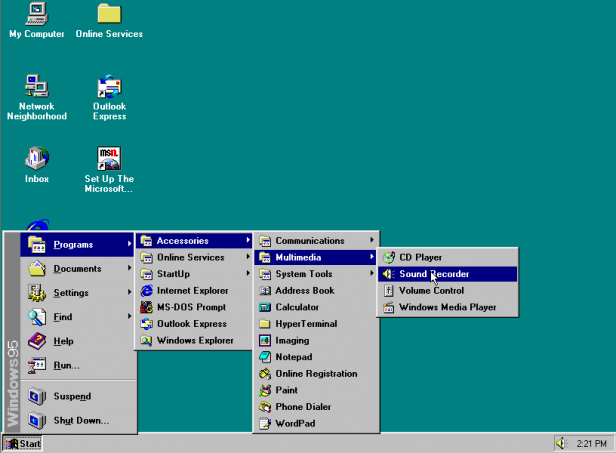 Image Credit: firealarms.redbat.ca
Windows 95 – Where it all started
The core features began in Windows 95. It’s easy to forget how big a deal Windows 95 was when it came out – back then it was like an iPhone launch is now. The familiar “Programs” setup started here and it would remain largely untouched for several years.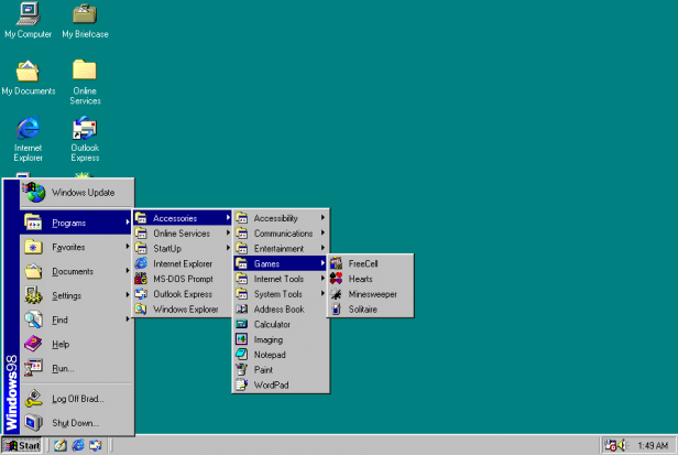 Image Credit: firealarms.redbat.ca
Windows 98 – It’s more or less the same
It’s spot-the-difference time, here. There’s a little more colour and the font’s no longer bold, but it’s basically the same. It was the same for Windows ME, a version of Windows that everyone wants to forget.
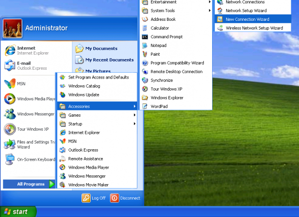 Image Credit: vpnme.com
Windows XP – Possibly the ugliest version of Windows ever
Clearly someone said “make it colourful” when developing Windows XP, and boy did they. The standard green and blue theme was eye-popping, though a more muted silver theme was more palatable and you could fall back on “Classic” look as well.
Related: Windows 10 vs Windows 7 – Should you upgrade?
As for the Start Menu, XP started to evolve the formula a little. It now had two columns, with key apps such as Internet Explorer and Outlook getting more prominence, and a column of shortcuts to your personal folders.
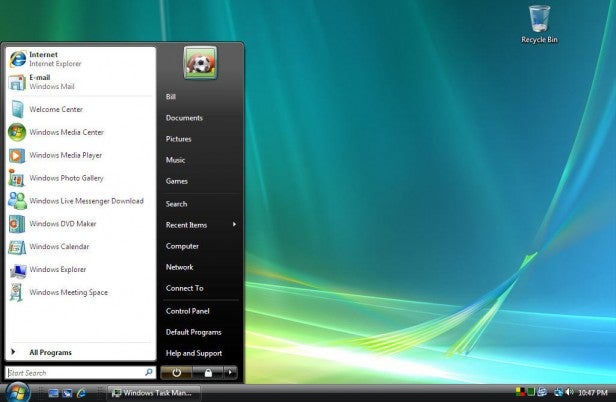 Image Credit: thespinningdonut.com
Windows Vista – The best version of Windows… said no one ever
No one remembers Vista fondly – it was slow, buggy and fell way short of the ambition Microsoft initially promised. As for the Start Menu, the style was more elegant and stylish, but this is arguably where things started to go wrong.
Related: How DirectX 12 will transform PC gaming on Windows 10
The addition of search was welcome, but the way that “All Programs” was confined to a list within the menu was annoying. It was a necessary change in some respects, as the old way had its own problems, but the solution wasn’t an improvement.
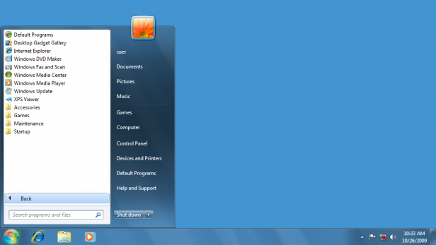 Image Credit: toastytech.com
Windows 7 – Vista fixed
Windows 7 was to Vista what Windows 10 is to Windows 8 – a vital remedy to a serious blunder. But the Start Menu was largely the same. It was as if Microsoft had run out of ideas. Worse still, the Start Menu ceased to be all that important or useful – it wasn’t where you started normally. That loss of direction was reflected in what came next…
Windows 8 – WTF is this?
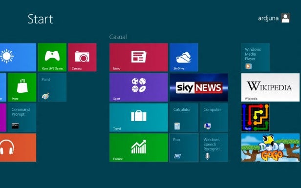
And then everything went a bit Pete Tong. Microsoft didn’t just update the Start Menu in Windows 8, it killed it – there wasn’t even a button for it. Instead there was the Start Screen, a touch-friendly interface designed for tablets and touchscreen laptops. Everyone loved it, and it was a particular delight when used with a mouse-and-keyboard setup.
Windows 10 – So good, they skipped 9
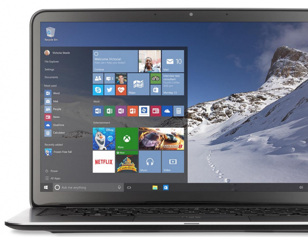
And now we have Windows 10, which we think has the best version of the Start Menu ever – it’s great. We love the semi-transparent look, while the combination of old and new really works.
Live Tiles are touch-friendly and let you organise your application however you like, and you can resize the menu to make it as small or as large as you like.
Related: How Microsoft is bringing the iconic Start Menu back to life
The list on the left includes shortcuts to important features, and shows you your most used applications as well. It gives you everything you need to “start” whatever you want to do, which is exactly what you need.
Watch – A quick guide to what’s new in Windows 10

