 Microsoft occupies an odd position in the computing landscape. It has firmly embedded roots in both corporate IT and home computing, as well as a growing number of branches into consumer electronics, the web, communications and gaming. It may be too early to call time on the age of the PC but Microsoft clearly recognises the need to grow the consumer side of its business. The problem is, to succeed in that sector requires one thing that is in short supply in Redmond – cool.
Just what is it that makes Apple cool? Partly it is down to its unerring eye for industrial design. Even if you prefer to run Windows instead of OSX or rock an Android phone rather than an iPhone it is hard to deny that the guys in Cupertino make some desirable kit.
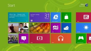
Windows 8 looks great but is it too stigmatised?
And that’s the crux, really. The real problem here is Windows. Windows 7 is a brilliant product compared to what has gone before and Windows 8 looks like a genuine evolution, if not revolution. It is still Windows. Windows is bad memories of incompatible drivers, uninstall programs that don’t work properly and access rights that stop you doing what you want without offering the protection you need. Windows is rebooting after a major software update, complicated licensing structures and Clippy the paperclip offering to help write your resignation letter.
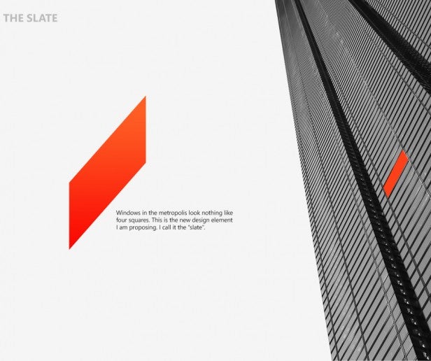
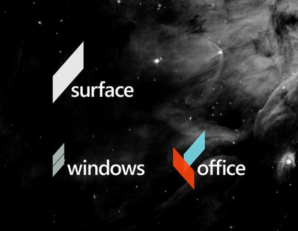
The Slate – A new look logo for Microsoft
Kim opted to create a single unifying logo for all of Microsoft’s main products. The ‘Slate’ is a simple diagonal bar, meant to resemble the window of an office block seen at an acute angle. It looks just enough like the Windows logo to save face, but no more.
Stuart Houghton is a former UK Associate Editor of Kotaku.com and has been writing about technology, games and geeks for over a decade and using technology, playing games and being a geek for much longer. He is also part of the IT team for a major UK charity.
- Follow Stuart Houghton on Twitter @stuarthoughton
- Follow TrustedReviews on Twitter @TrustedReviews or join us on Facebook
Read More:
Windows 8 Preview
Microsoft Surface Preview
Apple iPad 3 Review
Samsung Galaxy Tab 10.1 Preview
Editorial independence
Editorial independence means being able to give an unbiased verdict about a product or company, with the avoidance of conflicts of interest. To ensure this is possible, every member of the editorial staff follows a clear code of conduct.
Professional conduct
We also expect our journalists to follow clear ethical standards in their work. Our staff members must strive for honesty and accuracy in everything they do. We follow the IPSO Editors’ code of practice to underpin these standards.