Spotify changes green iOS logo, Twitter goes mental

There’s nothing strange about Spotify updating its app, but a mysterious hue-switcheroo has got the internet in a tizzy.
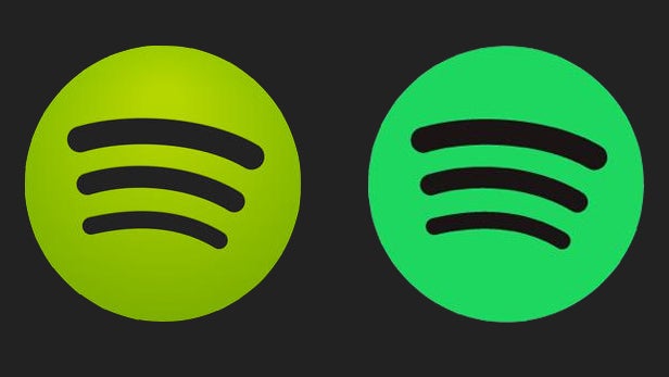
For some reason, Spotify has changed its iOS logo very slightly, going from a lime green to a more minty counterpart.
It’s also lost some of its 3D shading, instead adopting a more flat, matte texture.
The update was ambiguously peddled as bringing “minor improvements,” making no mention of the colour change.
Is Spotify transforming into the Hulk at a sloth-like pace? Perhaps the streaming service simply hates limes. We may never know the truth.
Related: Apple Music vs Spotify
What we do know is that Twitterers everywhere are confused, disoriented, and overly vocal about their opinions. Surprise, surprise…
“Spotify has changed the shade of green slightly and it’s annoying me so much.” – maxxxxx
“Spotify’s new logo makes me wanna kill myself 37 per cent more than the old one.” – Calebmateo99
“The spotify update changed the hue of the green colour and it’s really messing with my head.” – coopbran
“Why is the Spotify app suddenly a gross minty green?
“Spotify changing the green colour for the app is giving me anxiety.” – elizabethmaroo
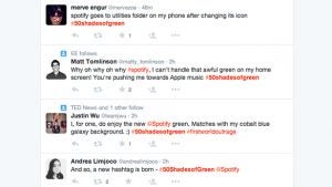
There’s even a hashtag – #50shadesofgreen:

Is this Spotify’s latest ploy to take on the soon-to-launch Apple Music streaming platform? If it is, we’re very confused.
Did you notice Spotify’s sneaky colour switch-up? Let us know in the comments.


