
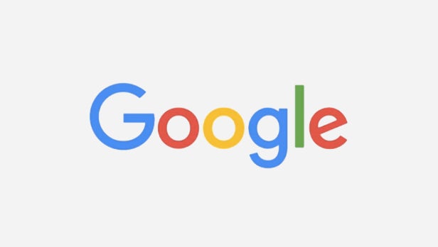
Google has just unveiled a brand new logo.
In place of its old serif typeface, Google has now adopted a smooth, rounded sans serif font.
The colours have also been dulled a little. In fact, the logo looks in keeping with Google’s ‘material design’ Android 5.0 Lollipop aesthetic.
Google revealed the new logo in a Google doodle on its web-search home-page, where a disembodied hand scrubs out the old branding, to be replaced by the new one.
The company has even created a YouTube video showing how Google has evolved over the ages.
You can watch it below:
(YouTube) olFEpeMwgHk(/YouTube)
“Google has change a lot over the past 17 years,” explains the search engine giant. “From the range of our products to the evolution of their look and feel.”
It continues: “And today we’re changing things up once again.”
Related: Best Web Browser 2015
This move comes just one month after a huge reworking of the company that saw Google fall under a newly-created parent company called Alphabet.
It’s likely that this new logo is part of the overarching revamp.
What do you make of Google’s new logo? Let us know in the comments.
Editorial independence
Editorial independence means being able to give an unbiased verdict about a product or company, with the avoidance of conflicts of interest. To ensure this is possible, every member of the editorial staff follows a clear code of conduct.
Professional conduct
We also expect our journalists to follow clear ethical standards in their work. Our staff members must strive for honesty and accuracy in everything they do. We follow the IPSO Editors’ code of practice to underpin these standards.