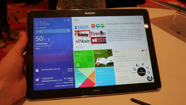
Samsung defends Magazine UX’s Windows 8 similarities

Samsung has defended its new tablet Magazine UX interface, suggesting similarities to Microsoft’s Windows 8 platform are not an issue.
Launching aboard the newly confirmed Samsung Galaxy NotePro and Samsung Galaxy TabPRO devices, the new Magazine UX has replaced the icon-based TouchWiz interface with a new, tile-based interactive system.
Despite a number of visible and functional similarities to the Windows 8 system found on the likes of the Microsoft Surface Pro 2, Samsung has claimed that its new tablet interface has been inspired by consumer demands, not the efforts of competitors.
“I don’t think it matters [that it looks like Windows],” Shoneel Kolhatkar, Samsung’s Senior Director of Product Planning told TrustedReviews.
He added: “
Bringing more information to the fore to create a “zero-click” means to access a bevy of information, Samsung has claimed that the Magazine UX will provide consumers with a more user-friendly experience.
“I think that a lot is informed by consumers, more than anything else,” Kolhatkar stated. “Ultimately we feel that we are providing something for the consumer that they want.”
He added: “You switch your device on and you need instant access, you want zero-click access to information. That’s what the Magazine UX gives you, at once glance it will give you the weather, your meetings, all of it.”
Do you think the new Magazine UX shares a few too similarities to Microsoft’s Windows 8 interface? Let us knw via the comments boxes below.
Read More: Samsung Galaxy Note 10.1 2014 review

