Netflix has revealed a brand new interface for its TV apps, which is designed to ensure users spend less time browsing and more time watching shows and movies.
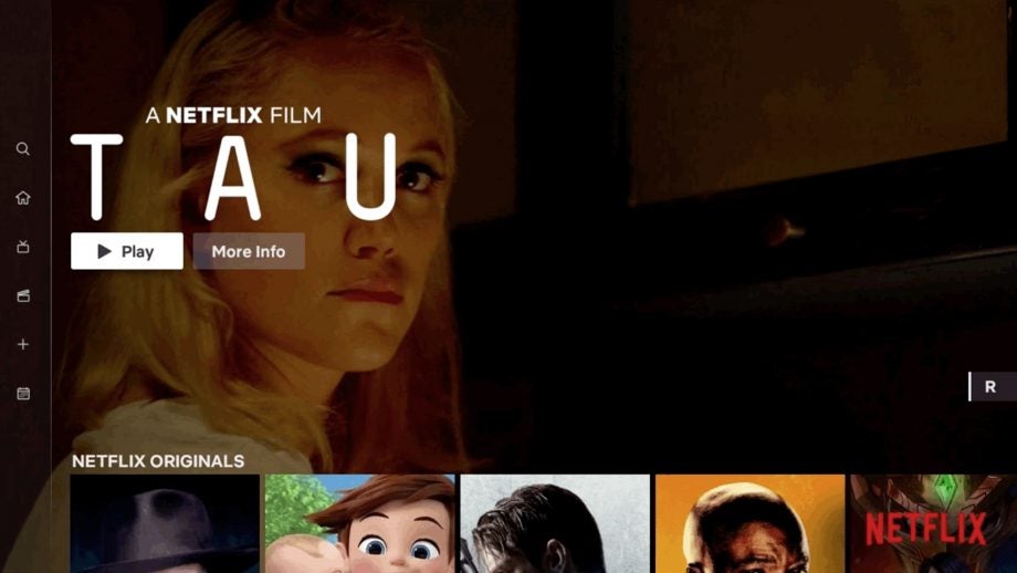
The new interface, which is rolling out to users from today, intends to make it easier for viewers who’re limited to a remote control rather than a touchscreen. The Search and My List areas have been relocated to a ribbon on the side of the screen for easy access. There are also tabs for Movies and TV shows, which immediately enables viewers to split the content.
Related: Netflix vs Amazon Prime
Netflix says this will cut down on browsing time because, even if we come to the Netflix app with an open mind, we generally know whether we want to settle in for a movie or catch an episode or two of a TV show.
Browsing between these sections will show a range of top content, and begin playing large-screen video previews of the titles it is showcasing/thinks you’ll enjoy.

Stephen Garcia, the Director of Product Innovation writes: “It is also far simpler to start browsing with either a series or movie; our research has shown us that while a member generally isn’t sure what exact title they want to watch, they have a pretty good sense of whether they are in the mood for a quick series episode or a longer movie experience.”
There’s also a tab for New content, which will be handy for those looking to explore the 9,262 pieces of original content Netflix adds in any given week. Netflix says that although these changes probably seem obvious and yes, yes they are. However, the streaming firm says the changes come after extensive research, testing and technology improvements.
Garcia adds: “Along those lines, we will continuously learn from our members and evolve the TV experience so that it gets even more simple, fun and easy to find the stories that make Netflix great.”
Is Netflix still the number one streaming service in your home? Drop us a line @TrustedReviews on Twitter.

Editorial independence
Editorial independence means being able to give an unbiased verdict about a product or company, with the avoidance of conflicts of interest. To ensure this is possible, every member of the editorial staff follows a clear code of conduct.
Professional conduct
We also expect our journalists to follow clear ethical standards in their work. Our staff members must strive for honesty and accuracy in everything they do. We follow the IPSO Editors’ code of practice to underpin these standards.