Google has announced a complete revamp of its Google+ social network to offer particular focus of two of the most popular features.
The company has been trimming away a lot of the fat in recent months and has now relaunched G+ centred around Communicates and Collections.
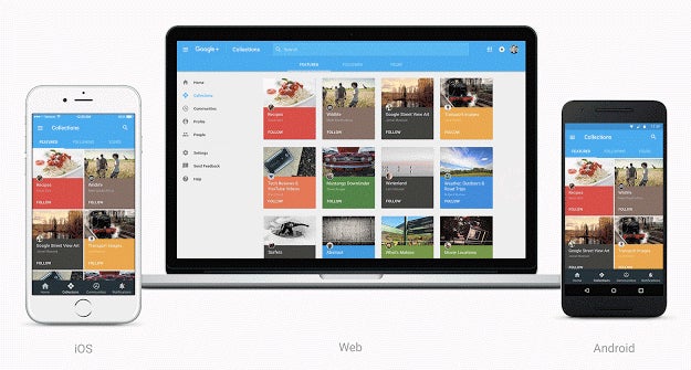
As has the new Collections feature which launched just five months ago. It enables users to group their posts by topic making it easier for people to organise what they’re into.
Google points out that 40,000 people are currently following an antique watch hobbyist’s posts on the Watch Project Collection, for what it’s worth.
The firm also says users can now expect a consistent Material Design-based look and feel across all platforms, with a rollout starting today.
The update is coming to the iOS and Android apps today, while users will need to opt in to the new design on the web.
See also: What is Alphabet?
“Today, we’re starting to introduce a fully redesigned Google+ that puts Communities and Collections front and center,” wrote Eddie Kessler, Director of Streams, in a post on the Google blog.
“Now focused around interests, the new Google+ is much simpler. And it’s more mobile-friendly—we’ve rebuilt it across web, Android and iOS so that you’ll have a fast and consistent experience whether you are on a big screen or small one.”
So the new Google+ effectively harks back to the old days of web forums for people with like minded interests. Sometimes, in the tech world, the more things change, the more they stay the same.

Editorial independence
Editorial independence means being able to give an unbiased verdict about a product or company, with the avoidance of conflicts of interest. To ensure this is possible, every member of the editorial staff follows a clear code of conduct.
Professional conduct
We also expect our journalists to follow clear ethical standards in their work. Our staff members must strive for honesty and accuracy in everything they do. We follow the IPSO Editors’ code of practice to underpin these standards.