Google has announced a new layer for the Google Maps application, aimed at giving users a snapshot of the coronavirus situation in countries and areas they may be considering traveling to.
The company is launching a new layer for its iOS and Android apps that shows the state of play regarding COVID-19 cases in a particular region.
Tapping the new COVID-19 info layer will show a seven-day average for confirmed coronavirus cases per 100,000 people in the area. The labels will be colour coded to show whether the trend is going in the right or wrong direction.
Related: Best Android apps 2020
“Trending case data is visible at the country level for all 220 countries and territories that Google Maps supports, along with state or province, county, and city-level data where available,” the company writes in a blog post on Wednesday.
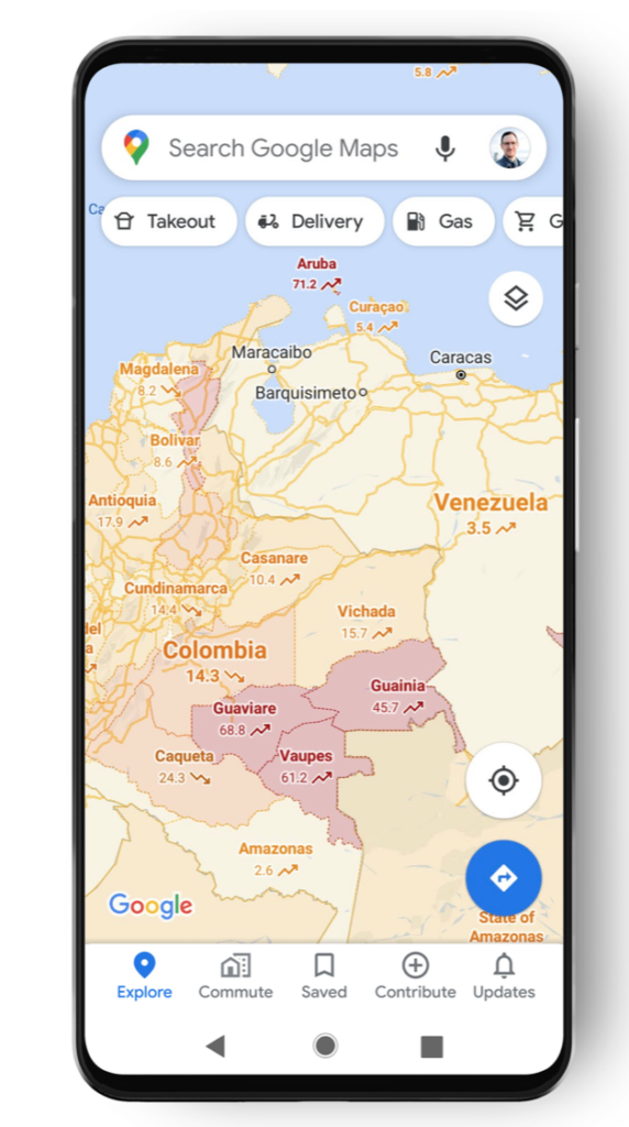
The idea is to give users reliable information on hotspots so they can avoid them if possible. On the flip side, if data suggests a low infection rate or a serious downturn, users might be more open to travelling to that location.
Google says it gets the data from public health organisations at national and local level, the World Health Organisation and as well as authoritative sources like John Hopkins University in the United States.
The addition follows Google’s efforts to bring information on testing sites and Covid measures at businesses into the Maps app and ecosystem. We’re kinda hoping these features wouldn’t be necessary going into 2021, but right now it really doesn’t look good now does it?
Google adds: “While getting around is more complicated these days, our hope is that these Google Maps features will help you get where you need to be as safely and efficiently as possible. The COVID layer starts rolling out worldwide on Android and iOS this week.”
Having had a brief check, the feature doesn’t appear to be live on iOS in the United States right now, but it might take a while to reach all users.

Editorial independence
Editorial independence means being able to give an unbiased verdict about a product or company, with the avoidance of conflicts of interest. To ensure this is possible, every member of the editorial staff follows a clear code of conduct.
Professional conduct
We also expect our journalists to follow clear ethical standards in their work. Our staff members must strive for honesty and accuracy in everything they do. We follow the IPSO Editors’ code of practice to underpin these standards.