Google has quietly launched a new layout for its web version of Maps.
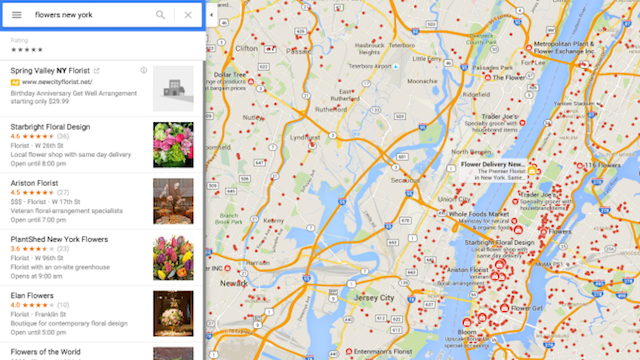
The new interface, which now allows users to sort results by star ratings, introduces a single sidebar/menu for results instead of a dropdown menu consisting of separate information cards.
Google has been testing the new layout for some time but the redesign, which seems to be heavily based on Material Design, now appears to be live.
There’s been no word from the company yet but users from various countries are reporting the changes.
Searching for directions has been made easier by the addition of the sidebar, which now lists the various alternatives one after another rather than stacking them on top of each other in separate information cards.
Related: Google’s OnHub is practically a Chromebook
Another simple new feature which could have a big impact is the ability to filter results for businesses based upon their star reviews.
Individual listings for specific companies and organisations have also been overhauled to include an image and clearer layout.
The new individual listings cards make it easier to access more information with quick buttons for sharing, searching nearby, and jumping directly into Street View.
What do you think of the new-look maps? Let us know in the comments.

Editorial independence
Editorial independence means being able to give an unbiased verdict about a product or company, with the avoidance of conflicts of interest. To ensure this is possible, every member of the editorial staff follows a clear code of conduct.
Professional conduct
We also expect our journalists to follow clear ethical standards in their work. Our staff members must strive for honesty and accuracy in everything they do. We follow the IPSO Editors’ code of practice to underpin these standards.