Google Chrome set for Material Design overhaul

There’s evidence that Google is almost ready to supply its Chrome web browser with a crisp new look.
One area of Google’s vast software empire that has remained curiously untouched by its Material Design philosophy is Chrome. The world’s most popular web browser has basically looked the same for some years now.
That looks set to change (a little) in the near future. TNW reveals that a recent request on Google Code has pointed the way to a Material Design overhaul.
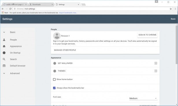
These changes will be implemented from version 50 of Chrome. We also get to see some of the changes thanks to some supplied screenshots.

As you can see, it’s not a vast change from previous versions. The tabs now have square edges, and the old faithful hamburger menu button is being jettisoned in favour of a three-dot motif.
What you can’t see from the screenshots, but which is described in the report, is the fact that the new Chrome’s buttons now animate when clicked. If you’ve used an up-to-date stock (or lightly modified) version of Android over the past two years, you’ll be familiar with such flourishes.
Related: Best web browsers
All of the main buttons and menus (such as Downloads, Extensions, Settings and History) have been redrawn, and Incognito mode is now all-black.
There’s no time frame for the implementation of this new design. However, all of these changes are available for testing now, and should be making their way to Windows, Chrome OS, and OS X versions of the Chrome app before too long.


