Google Assistant’s dark mode should have stayed in the shadows

With the rise of OLED screens and people lying in bed after hours looking at their phones, the idea of the dark mode is having a moment. People want to look at their phones without frying their retinas.
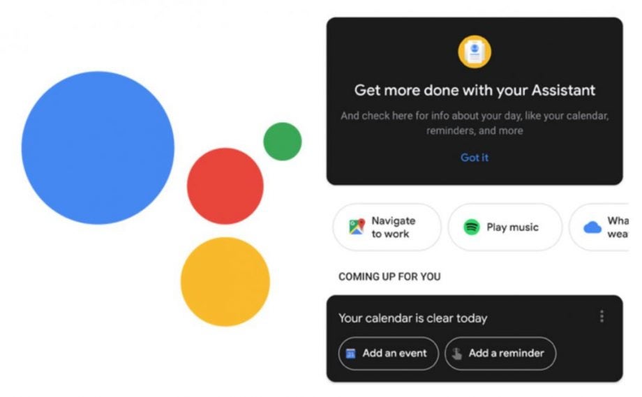
Sadly, Google Assistant’s new night time look is closer to dork mode than dark mode.
The point of a dark mode, generally, is to eliminate the scaldingly bright whites, protecting the eyes of those using the app. A true dark mode, which many people are calling for in apps like Twitter, means the colour is pitch black which on OLED screens means the pixels will be turned off, which saves battery life.
Related: Best VPN
While the cards that make up the bulk of Google Assistant have been picked out in a dark hue, the actual look is just of black cards on a white background, meaning that bright white is still there to mess up your day, and the dark mode is somewhat pointless in its current iteration. It’s a disappointing attempt from Google, who generally do a pretty good job with their design.
This change doesn’t appear to have rolled out to everyone yet, and no one in Trusted Towers can yet get access, so here’s hoping this beta test encourages them to put a bit more care into the implementation.
This beta test also involves a reshuffle to a couple of other Google Assistant features, and as previously stated this isn’t the definitive launch release, so we could see a more sweeping change to both Google Assistant and this half-formed dark mode sometime in the near future.
Do you have access to the beta? How do you feel about dark mode on your apps? Let us know on Twitter (used in dark mode, we hope) at @TrustedReviews
Editorial independence
Editorial independence means being able to give an unbiased verdict about a product or company, with the avoidance of conflicts of interest. To ensure this is possible, every member of the editorial staff follows a clear code of conduct.
Professional conduct
We also expect our journalists to follow clear ethical standards in their work. Our staff members must strive for honesty and accuracy in everything they do. We follow the IPSO Editors’ code of practice to underpin these standards.