Sections
- Page 1 Android 8.0 Oreo Review
- Page 2 Project Treble, Autofill, Performance and Verdict Review
Verdict
Pros
- Project Treble could solve Android update waits
- Good general performance
- Upgraded wireless audio
Cons
- The best features are slow-burners
- Picture in picture is limited, not that useful
Key Specifications
- Notification snoozing
- aptX HD and LDAC support
- Notification dots
- Simplified settings
- Autofill
What is Android 8.0 Oreo?
Android Oreo is the eighth major revision of Google’s mobile OS, released in August 2017. At first glance, it might look as though little to nothing has changed but a deeper dive reveals that Google has been toying with adding low-key functionality and making some fine-tune adjustments to some of the features we were introduced to on the previous year’s Android 7.0 Nougat release.
Related: Best Amazon Prime Day Deals 2018
I’ve been using the Google Pixel to see what a true vanilla Android 8.0 Oreo device offers.
Android 8.0 Oreo – Design and UI changes
Expecting a radical new look for Android with version 8.0 Oreo? Then you’re going to be disappointed; it looks just like version 7.0.
Related: When will my phone get Android Oreo?
For a Google Pixel this means the drag-up apps menu remains, but with a white background; your apps look as though they’re sitting on a sheet of paper. You can now flick up anywhere on the screen to summon the apps menu, but this applies only to a handful of 8.0 phones.
Any major effort put into changing how Android 8.0 Oreo looks on the surface would be wasted anyway. Samsung, Sony, Huawei, HTC and most other phone makers still use their own interfaces on top of Android.
Related: Samsung Galaxy S8 vs iPhone 8
![]()
![]()
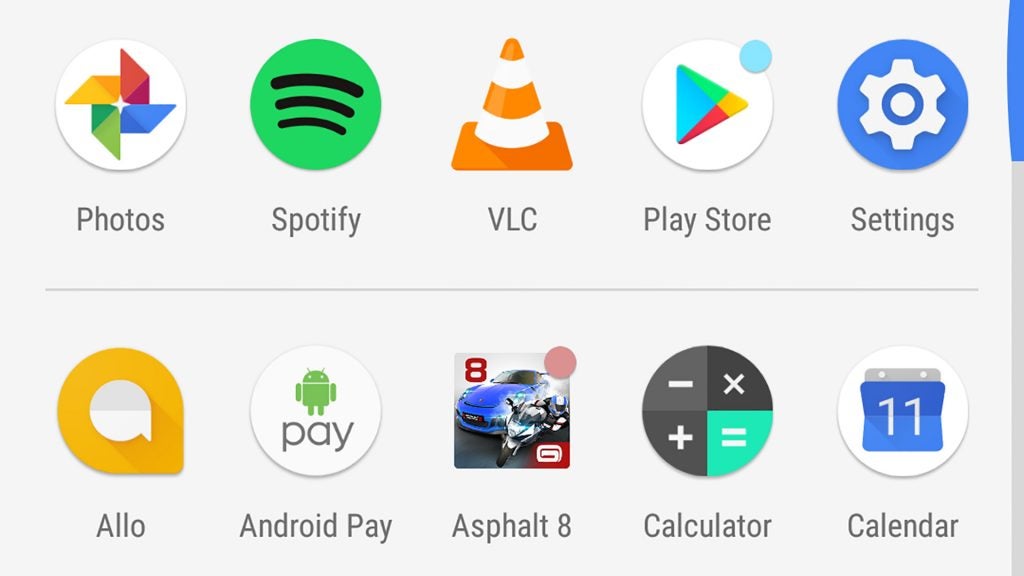
One of the aesthetic features discussed in the beta versions of Android 8.0 was the ability to alter the shape of icons: circles, squares, rounded-off squares. These are called adaptive icons, and they’re here to sort out the shape-filled mess of most app menus.
Of course, the Pixel and Pixel XL already display round icons. And in the version of Android 8.0 on my Pixel, there isn’t actually an option to change the shape of the icons.
Unless Google suddenly decided that adaptive icons weren’t ready for prime time (not all beta features make it into the final release), I’d bet the company is simply giving developers the opportunity to update their icons to suit these new options. This functionality is missing from the Sony Xperia XZ1 (also running 8.0) that I’m currently using as well as the Pixel.
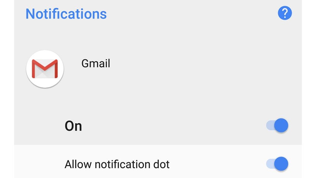
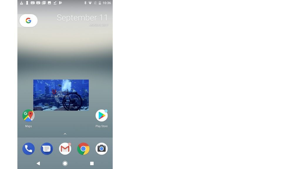
Android 8.0 – Notification dots
Notification dots have made the cut, and change how your phone looks a little. Once you start using your Android 8.0 phone, you’ll notice that little coloured dots appear above app icons. These tell you there’s a new notification relating to the app.
Long-press this app icon and these notifications will pop up next to the quick-access shortcuts added to Android in version 7.0. For those still using an older version of Android, these shortcuts let you zip straight to a popular part of an app. I’m yet to see anyone actually use this feature, but at least notification dots will prod us into actually exploring the long-press gesture.
It also acts as an alternative to using the notification bar, something I’ve found myself using less frequently when a phone offers lockscreen notification previews.
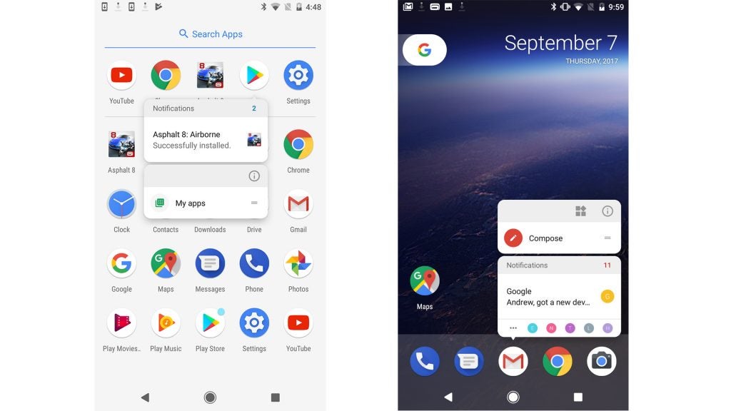
Android 8.0 – Notification dropdown
Android 8.0 also redesigns the notification bar somewhat. It’s whiter than ever, and if you start flicking around you’ll notice a few new features.
Notifications can be ‘snoozed’ like an alarm clock for a certain amount of time, from 15 minutes to two hours. I honestly can’t imagine using it when silencing the phone is simply quicker, but it might prove handy if you just need to stop WhatsApp bleating in order to get some work done.
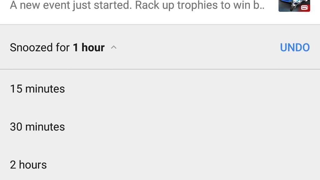
It’s by no means an obvious feature to access, however. To get to it you have to slowly drag a notification right, which then brings up the snooze icon.
Next to this snooze function you’ll see a Settings icon. Tap this and you can choose the category of notifications that get through. Google has made these mandatory for new apps and app updates.
For example, the Google Play app has a whopping six different categories of notification, from security and maintenance messages to account alerts and new updates.
Can I imagine many normal people using this feature? Absolutely not. But for the real Android enthusiast ,it’s a way to tame the notifications of poorly designed or exploitative apps you just can’t uninstall for one reason or another.
Android 8.0 – Picture-in-picture
One of the other lead features of Android 8.0 is picture-in-picture. This lets you open up a small video screen that floats above other apps.
Samsung actually offered this feature five years ago in the Samsung Galaxy S3, before quietly retiring it in recent generations as part of its move to makes its phones classier and less complicated.
Frankly, in Android 8.0 it’s as pointless as it was in old third-party Android UIs – unless you have a specific need to take notes from a video. And then it suddenly becomes a godsend.
Right now the feature works with VLC and YouTube, but since you need a $10-a-month Red subscription to use it with YouTube, the feature suddenly becomes 95% less useful. Thanks, YouTube.
VLC’s application of the feature is also a little faulty at the moment; the screen often just disappearing if you fiddle with it too much.
That it took Google this long to add the PiP feature is odd, too. It arrives just in time to watch the Android tablet market dwindle to the withered kernel it’s been developing into for years. Tablets can make better use of PiP than phones. I can’t even imagine using this feature in a giant phone such as the Galaxy Note 8. My take is that Google thinks it’s important because Apple added it to the iPad in iOS 9.
Caveat: if you’re a student who watches video lectures, this feature could still prove useful.
Android 8.0 – Redesigned music controls
If you’re not getting the message yet, I’m not all that excited about everything Android 8.0 has to offer. Some of the surface froth is enjoyable, though.
For example, Google has altered how music sources appear in the dropdown menu. Play Spotify on an Android 7.0 phone and you’ll see the usual track controls, the name of the tune you’re playing, and a little thumbnail of the album cover.
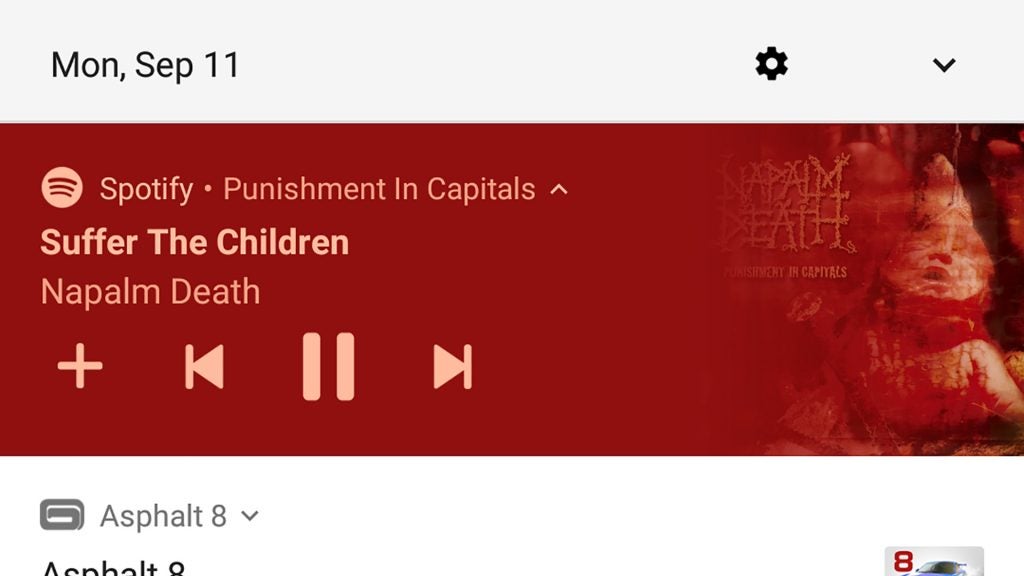
Android 8.0 actually colour-co-ordinates the app’s dropdown entry to match the colours of the album cover. Play the Cars 3 soundtrack and you get red text on a black background. Napalm Death’s Punishment in Capitals gets you peach text on a red background: very Napalm Death.
It’s design confection, but does make your music controls stand out in the notification bar better than before. I quite like this bit.
How we test phones
We test every mobile phone we review thoroughly. We use industry standard tests to compare features properly and we use the phone as our main device over the review period. We’ll always tell you what we find and we never, ever, accept money to review a product.

Editorial independence
Editorial independence means being able to give an unbiased verdict about a product or company, with the avoidance of conflicts of interest. To ensure this is possible, every member of the editorial staff follows a clear code of conduct.
Professional conduct
We also expect our journalists to follow clear ethical standards in their work. Our staff members must strive for honesty and accuracy in everything they do. We follow the IPSO Editors’ code of practice to underpin these standards.