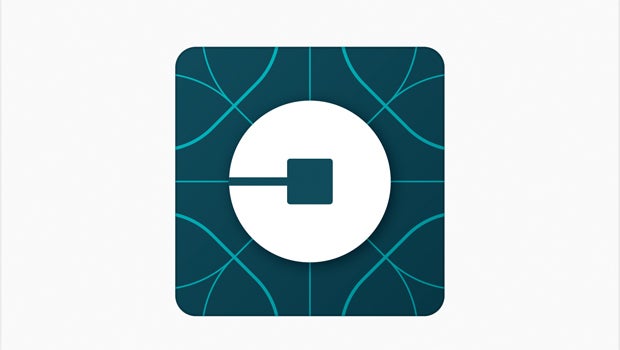
Uber’s new logo proves ride-sharing is only the beginning

Uber has revealed a brand new logo, which hints at future way beyond its origins as a ride-sharing mobile app.
Gone is the instantly-iconic black ‘U’ logo and on the white background. In its place is a square with a circular ‘bit’ in the middle.
Uber says that ‘bit’ will be a feature of other products in the portfolio and will make it easy for the public to identify other Uber products.
“One of the big changes over the years is that Uber no longer moves just people; we’re now moving food, goods, and soon maybe much more,” said CEO Travis Kalanick in a press release (via The Verge).
“
The firm is already diversifying into other services like the food delivery service UberEATS, the delivery service UberRUSH and the carpooling platform UberPOOL. It also has an interest in the emerging driverless cars industry.
The branding change begins today with a new Rider application and a new Partner (read: driver) application, which can be updated today.
See also: Tesla Model X: 6 features that will make you want one
The company says the backgrounds to the app ‘bit’ may vary depending on which region you might be in, with the firm studying textiles and architecture in countries like Ireland and Mexico.
“The team has spent months researching architecture, textiles, scenery, art, fashion, people and more to come up with authentic identities for the countries where Uber operates,” said Kalanick.
“Every city has its own character and our long term goal is to have unique designs for cities as well as countries. This will mean adding hundreds more color palettes and patterns overtime.”
(apester:5657160541f2d0122bbf2e33)
What do you think of Uber’s new design? Let us know in the comments below.


