Microsoft Arrow Launcher Review
Microsoft Arrow Launcher
Hands-on: Microsoft's created an Android app launcher, for some reason

Verdict
Pros
- Nice and fast
- Swipe up quick settings menu really useful
- It moves your apps around as it learns which you use most
Cons
- It moves your apps around as it learns which you use most
- App Drawer takes ages to scroll through
- Discourages creating app folders
What is Microsoft Arrow Launcher?
Arrow Launcher is a new Android launcher made by, of all people, the folks at Microsoft. Like other launchers it replaces the homescreens and app draw of your phone to provide a fresh route into the rest of the handset’s features.
Microsoft’s twist is that Arrow Launcher aims to make your Android-using life easier by bringing to the fore the apps you use most, and pushing aside the least used features. And rest assured it doesn’t push any Microsoft apps or features onto you, except for the wallpaper being provided daily by the Bing search service, if you so choose.
Arrow Launcher – First Impressions
Upon launching Arrow Launcher for the first time the app will analyse and rank your existing apps, picking out up to 16 that it thinks are your favourites. You can confirm which of these are indeed your favourites and then the launcher will fill up your homescreen with these apps.
What’s immediately obvious is that upon doing this you lose all your app folders. The whole point of the app is that it curates the layout of your apps for you so using folders is counter to this.
That’s all very well but if you’re like me and you normally have a dozen folders each containing half a dozen apps, suddenly going back down to a grid of just 24 is something that, at the very least, will take time to get used to and at worst will be a deal breaker for this launcher.
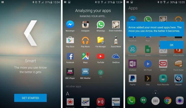
The setup process analyses your apps and picks out the top 20 to go on your homescreen
What’s more, although I like the idea behind the curation, the app didn’t seem to do all that good a job of guessing which are the most used apps on my phone. While it got a few correct, most were pretty obvious standard apps anyway – Google Maps, YouTube, Hangouts, etc – and a few were outright wrong.
For instance I’ve not played Punch Quest in over six months, I very seldom use the Contacts app and have never used OneNote.
What’s more, as the launcher does learn what you prefer it’s actually really annoying that it then moves your apps around. That is the core principle of the launcher but it’s also anathema to those that like to keeps things organised and know exactly where everything should be, which of course is one of the basic tenets of good app design.
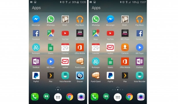
Original layout on the left, after about an hour’s use on the right
After longer use there will likely be fewer changes as apps firmly establish themselves as favourites, unless a new very popular app is installed. But, at least initially, apps are moving all over the place and it’s not to my liking.
The overall layout of the launcher consists of three pages, with Apps in the centre, People (contacts) on the right and Recent activity on the left. Underneath all three screens is a fixed set of four apps and the App Drawer button, all but the latter of which can be rearranged or made into folders, at least giving some way to bring some arganisation back into this interface.
Swipe up from the bottom and you get an iOS-style quick settings area that also houses an extra five apps (again, these can be made into folders). This makes it much easier to access quick settings that would otherwise require you to reach to the top of the screen to swipe down the notifications menu.
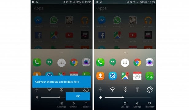
A swipe up menu provides really convenient access to common apps and settings
It’s a great feature and one that I’d encourage other launcher developers to mimic, though I’d like to see Microsoft let you choose which quick settings are available.
Both the People and Recent pages have their uses too. People seems to do a good job of highlighting who you most often contact and puts them in easy reach. Likewise, the Recent page I can see being useful as a one-stop solution for things like jumping straight to that file you just downloaded or the specific photo you just took, as well as showing you who called and who you just messaged.
I’m not entirely convinced both features work best as dedicated pages on a homescreen but the functionality definitely has potential.
Jump into the Edit Page screen from the swipe up menu at the bottom of the page and you can also choose to add a further two pages to the launcher. One is a Notes and Reminders tool that allows you to type notes right onto the page. It’s actually pretty slicky done and certainly is more convenient than opening up a notes app.
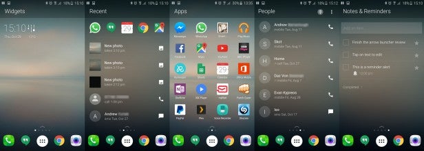
The other page is called Widgets, and it’s just a blank page which you can place standard Android widgets on.
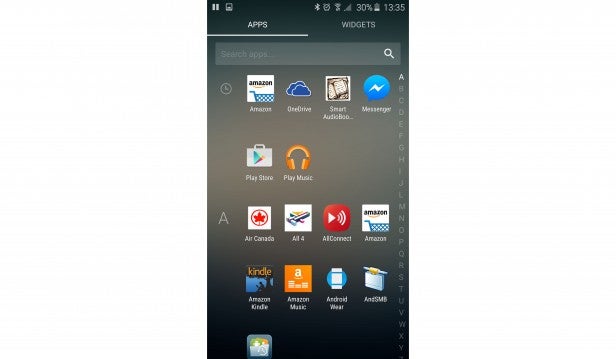
The final main feature is the App Drawer itself, which is arranged in an alphabetical list, with a search box at the top and a recently used section below. The strict at-least-one-line-per-letter layout doesn’t feel as efficient as a more conventional continuous list, but the search function does in part make up for this. I wouldn’t say I’m totally convinced by the change but neither does it totally put me off.
One final thing to note about Arrow Launcher is that it’s nice and fast. One of the topics not discussed enough when it comes to Android phones is just how transformative a new launcher can be when it comes to phone performance and sure enough the Arrow Launcher so far feels faster than the default Galaxy S6 one.
Early Verdict
Arrow Launcher is a slightly odd venture for Microsoft with there being no clear benefit to the company. Regardless, it’s an interesting twist on an Android app launcher that has a few key features I do like and some I’m less keen on. The iOS style swipe up menu is great and the launcher is fast, but its headline feature of choosing your app layout for you hasn’t convinced me yet. However, with an eye-watering price tag of zero pounds and zero pence, it’s worth giving a try.

