Verdict
Ask anyone who’s ever used a Windows Mobile smartphone about whether they enjoyed the experience and you’ll probably get a mixed answer. “The phone’s great,” they’ll probably say, “but it’s not very easy to use.” It’s a response I sympathise with, having owned and used a TyTN II in anger for the past five months.
I love the keyboard, the push email, the GPS and the Exchange Server synchronisation – they help me keep in touch with work at all times, but I yearn for an interface that’s a little more intuitive. And it’s not just the fiddly menus that grate. It’s the small things too, like the fact that the main contact search doesn’t search the full database properly, and that the phone number fields in contacts don’t default to numbers. It looks pretty dull too, in comparison to the iPhone’s fantastically slick OS.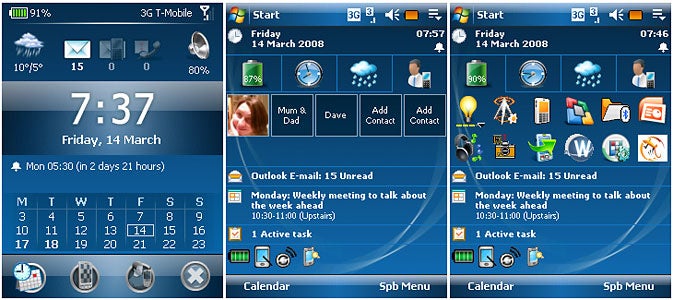
But Windows Mobile does have one major strength – and that’s the sheer number and breadth of applications available for the platform. As well as stand alone titles such as TomTom or CoPilot and a plethora of handy utilities, there are programs such as this – Spb’s Mobile Shell 2.0 – which are aimed at giving the interface a lick of paint.
I first came across Spb Mobile shell on a Glofiish phone last year. That was a cut down version that simply added an extra menu to the Today screen, but this version is much more powerful.
You still get the same basic plug-in as on the Glofiish phone – it’s the most basic of Mobile Shell’s enhancements, but a useful one nonetheless. This installs a tabbed menu, just below the time and date display, which provides quick access – via finger-sized buttons – to a program launcher, a world time and next alarm display, a five-day weather forecast and a quick dial panel where you can store your five favourite contacts.
The impressive thing about this, quite apart from the extra features and usability it adds to the otherwise fiddly, stylus-focused Today screen, is that it’s highly configurable. You can add tabs, and have the tab content auto-hide or remain on display as you see fit. This part of the Mobile Shell also allows the two soft buttons at the bottom of the Windows Mobile screen to be changed – not something you can do without getting your hands dirty and tweaking the registry in the standard version.
However, the real strength of Mobile Shell 2.0 lies in its ability to completely hide the stark, businesslike lines of the Today screen from view, replacing it with the much slicker, more modern-looking Now view.
This can be accessed in one of two ways: you can set up the software to kick into the view automatically whenever it’s brought out of a locked state; or you can (while in the standard Today Screen view) simply place your finger at the top of the screen and drag it down.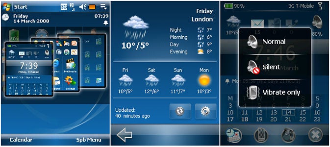
Whichever way you choose to access it, though, you’ll find it’s a massive improvement. There are two views to choose from – professional and classic – and both look cleaner, and more modern, and are much more immediately usable than the Windows Mobile Today screen.
Along the top of the screen, three icons clearly indicate unread emails, missed calls and received text messages, and in the top corners are handy battery and signal strength gauges. Flanking the missed calls and messages icons are a current weather icon and (in Professional mode) a quick profiles button. The latter is a boon for Windows Mobile users frustrated by the confusing multiple volume settings that have to be changed in standard Windows Mobile: just tap it and you have instant access to Normal, Silent and Vibrate only profiles.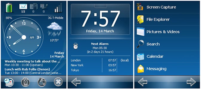
Other elements on the Now screen are similarly interactive – the weather icon, for instance, launches a new full-page five-day forecast view, complete with Night, Morning, Day and Evening breakdowns.
Below this, the clock view occupies the majority of the screen, and you can choose between either analog or digital displays. Again you can click this for a full page clock, alarm and world time view, and each item on the subsequent page links through to the relevant Windows Mobile settings page; tap Next Alarm, for instance, and you’re straight into the alarm screen settings.
Underneath the clock is a calendar view, which will display your next one or two appointments or an overview of the next week or two.
And there’s more. In addition to the Now screen there are two further elements to Mobile Shell: the SPB Menu and Contacts screens. These can be accessed directly from the Today screen in a number of ways: using the drag-down finger gesture and then moving your finger left or right to select between screens (very slick); by clicking one of the shortcut buttons that run along the bottom of the Now screen; or by using a finger gesture to ‘turn the page’ between each screen.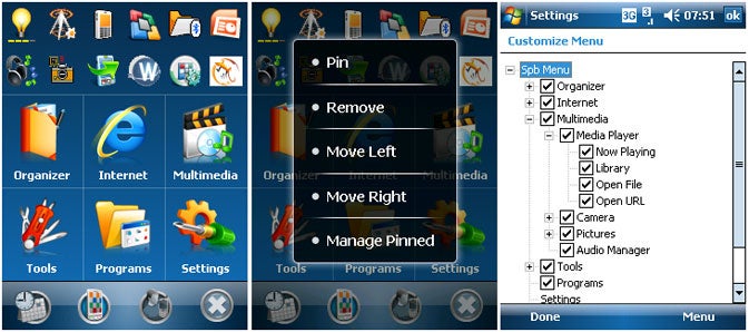
SPB Menu is essentially an application launcher, designed to replace the awkward Windows Mobile Start menu. In this view a list of 12 buttons run along the top of the screen allowing access to the 12 most recent applications, and below it six larger icons link you through to a series of sub-screens, with swish animated transitions (new to this version along with the gesture-driven navigation) accompanying each change of screen. The menu is completely configurable too: as well as turning options on or off, you can also add your own menus and sub-menus screens, links to applications and even files.
It sounds simple, but it completely changes the way you navigate through Windows Mobile, though alas once you finally click a button to launch an application, you have to drop back into the Windows Mobile way of doing things. Mobile Shell isn’t that clever.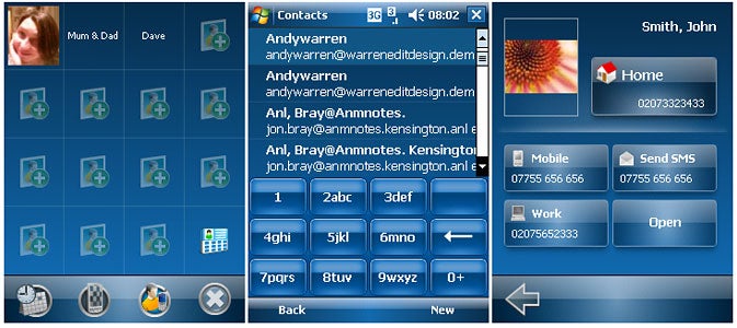
The Contacts view is essentially a quick dial pad with fifteen slots for your favourite numbers. Tap one of these and up pops a screen complete with large buttons that allow you to choose between calling the contact at home, work, on their mobile or sending a text – a lovely touch. A bit more digging, however, reveals the Contacts part of Mobile Shell to be its weakest area. It provides you with an on-screen number pad, for instance, that allows you to use T9 text entry to quickly search through contacts names or numbers, but this keypad doesn’t replace the Windows Mobile one – you can’t dial numbers that aren’t in your contacts list, for instance.
It’s a measure of the success of Mobile Shell in other areas, however, that I’m perfectly happy to overlook this small omission (the phone part of Windows Mobile is, after all, one of its easier to use elements) and recommend that anyone using a Windows Mobile smartphone with a touch-screen give this brilliant piece of software a whirl.
”’Verdict”’
It costs a paltry £15 and offers an extremely effective and flexible way of transforming Windows Mobile from clunky beast into something a lot more usable. If it had the option to permanently replace the Windows Mobile Today page with its fantastic Now screen, I’d take it up on its offer without hesitation.
How we test phones
We test every mobile phone we review thoroughly. We use industry standard tests to compare features properly and we use the phone as our main device over the review period. We’ll always tell you what we find and we never, ever, accept money to review a product.
Trusted Score
Score in detail
-
Usability 8
-
Value 9
-
Features 9
Editorial independence
Editorial independence means being able to give an unbiased verdict about a product or company, with the avoidance of conflicts of interest. To ensure this is possible, every member of the editorial staff follows a clear code of conduct.
Professional conduct
We also expect our journalists to follow clear ethical standards in their work. Our staff members must strive for honesty and accuracy in everything they do. We follow the IPSO Editors’ code of practice to underpin these standards.