Verdict
I’m a big fan of HTC devices. In fact I’d go as far as saying that HTC has done more to ensure the widespread acceptance of the smartphone than any other manufacturer. I accept that the Blackberry is ultimately responsible for the mobile email revolution, but for a long time RIM’s devices were one trick ponies, whereas HTC’s Windows Mobile devices tended to be all singing, all dancing, mobile powerhouses.
My current handset of choice is the Orange SPV E650, which is basically an Orange branded HTC S710. This is the perfect solution for me – not only does it look just like a normal mobile phone, with a normal keypad on the front, but it also has a slide-out full qwerty keyboard hidden away. The S710 represents a triumph for HTC, building on the success of the also excellent SPV M3100 (or HTC TyTN)before it. 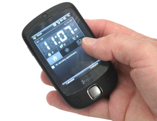
I was actually starting to believe that HTC didn’t know how to get anything wrong with its products, managing to produce one great, feature rich, incredibly usable handset after another. But then I got my hands on the new HTC Touch and I realised that even HTC could get things wrong, very wrong in fact.
With the Touch, HTC is trying to address the consumer market rather than the power mobile user. This seems somewhat strange since HTC has been so phenomenally successful with the corporate/power user in the past, having carved out an enviable reputation for itself, both with end users and the network operators that clamour to re-brand each and every handset that HTC releases.
The strangest thing about the Touch is that HTC obviously thinks that overlaying a touch-friendly skin on a bog standard Windows Mobile installation will instantly make it irresistible to consumers. Unfortunately HTC is very wrong. The TouchFLO interface actually works very well, but what you can do with it is so limiting that it may as well not be there at all. 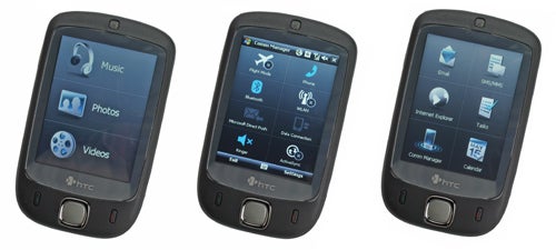
On the surface the TouchFLO interface is impressive. Turn the device on and you’re presented with the Home screen, then you simply slide your thumb from the bottom of the screen to the top to initiate your TouchFLO experience. Here you’re presented with one of three thumb friendly screens. One has a 3×3 grid for your most used contacts – here you can attach a photo to each of your contacts, so you simply tap the picture of who you want to call with your thumb – simple enough. The second screen is a 2×3 grid with shortcuts to Email, SMS/MMS, Internet Explorer, Tasks, Comm Manager and Calendar. The third screen is split into three portions for quick access to Music, Photos and Videos.
You can flip between these three screens by sliding your thumb from left to right, or right to left across the screen. The screen transition is pretty cool too, with each screen appearing to be on some kind of 3D carousel, so you’re treated to a rotation animation when changing screen. But the big problem is that once you dig deeper than these three thumb friendly screens, you’re just faced with a standard Windows Mobile interface, which is anything but thumb friendly.
Let’s say for example, that you click the SMS/MMS button with your thumb – you’re then greeted with the standard Windows Mobile SMS screen, and trying to navigate that with your thumb is, as Mia Wallace might say, an exercise in futility. This means that you need to take the stylus out and start stabbing at the virtual keyboard, just like with any other Windows Mobile device – hardly the revolutionary, consumer friendly device that HTC had insisted the Touch was at the launch last week.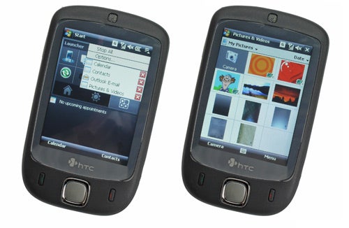
I encountered another serious annoyance the first time I closed an application after using it. So, imagine I was checking my calendar and wanted to close that application. The most obvious way to close a Windows Mobile app is to hit the X button at the top right of the screen, but if I do that, it dumps me back to the home screen. If I want to go back to the TouchFLO screen that I had come from I need to swipe my thumb from the bottom to the top of the screen – hardly intuitive. Personally I would expect to go back to the previous page when I close an application, but clearly the TouchFLO skin can’t quite manage that.
The TouchFLO interface does have some functionality in general Windows Mobile apps though. If you access your Contacts list, you can scroll through them quickly by sliding your thumb up the screen. The contact list will whiz up the screen and then slowly come to a halt, like a roulette wheel losing momentum. You can stop at any point by tapping the screen, but is this faster than using the stylus and the scroll bar? No. Is it quicker than tapping in the first letter of the name you’re looking for, then selecting it? No. Is it a useless gimmick that’s implemented to make the TouchFLO skin seem worthwhile? Yes!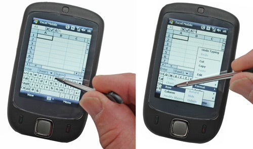
Although HTC was quite adamant that the iPhone had no bearing on the Touch, it’s pretty much impossible to believe that Apple’s forthcoming foray into mobile communications wasn’t the driving force behind this product. One of the HTC guys went as far as saying that he’d never even seen the iPhone – yeah, right! The big difference between the Touch and the iPhone, is that Apple has designed a device with an intuitive interface that allows users to access everything with a tap of their thumb, whereas the Touch has a clumsy skin overlaid on a bog standard Windows Mobile OS. Given, I haven’t actually got my hands on an iPhone yet, but even being the most sceptical non-Apple-fanboy, I have to admit that when it comes to great user interfaces, Apple knows what it’s doing.
Of course the fact that an entire screen on the TouchFLO skin is dedicated to Music, Video and Photos makes it pretty obvious that HTC is going for the consumer who is more interested in fun than function. The only problem with this approach is that the hardware is missing an integral feature – it doesn’t have a 3.5mm headphone socket! The only output option available is a mini-USB port, which the bundled hands-free headset can plug into. Unfortunately there is no headphone socket on the hands-free either, so you are left having to listen to your music through the woefully inadequate bundled hands-free earphones!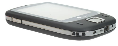
It is completely beyond me how any manufacturer can expect a product to be taken seriously as a music player without a 3.5mm headphone socket of some kind. Yes, I’m aware that you can get mini-USB to 3.5mm headphone socket cables, but you shouldn’t have to resort to third party accessories to add functionality that should be intrinsic to the design. The fact that HTC bundles a 1GB micro-SD card is also somewhat moot, since clearly the intention is for you to store music and video on it, neither of which you will enjoy without a decent set of earphones.
So, when you take the TouchFLO skin and pretensions of being a pocket media player out of the equation, you’re left with a very slim and light Windows Mobile device. About a year ago, I would have been very impressed with a device like this. In fact I ”was” very impressed with a device like this about a year ago, when we looked at the Orange SPV M600, which was, unsurprisingly an HTC device. In many ways the Touch is just a slimmed down version of the M600, which would have been no bad thing back then, but the game has moved on. If you look at the Orange SPV M700, which is the successor to the M600, you’ll see that it features both HSDPA for fast data download and an integrated GPS module. So, while the M700 may be larger and heavier than the Touch, you get lightning fast Internet, video calling and can use it for satellite navigation.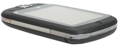
In reality then, the Touch is a somewhat dated Windows Mobile device in a very pretty party dress.
HTC also made a big deal of the new Home screen features on the Touch, and I have to admit that it’s pretty good. First up, there’s a very large digital clock, so it’s easy to check the time via only the briefest of glances. There’s also a thumb friendly tab that gives you the weather forecast, which works pretty well. However, you have to manually tell the Touch what city you’re in, in order for it to give you the weather report – personally I would have thought it should be able to automatically tell where you are via the cell that you’re currently communicating with. A third thumb friendly button takes you to an application launcher screen, which has ten, just about thumb friendly buttons from which you can launch your favourite apps. The same old problem rears its head here though, once you’ve tapped the button with your thumb, you’ll need to resort to the stylus in order to use the application!
The Touch weighs in at 114g, which is just over 20g lighter than the iPhone. It definitely doesn’t feel heavy in your pocket, and the dimensions of 100 x 58 x 14mm are pretty svelte for a smartphone. Although the Touch is smaller than the iPhone, it’s slighter thicker – plus it’s worth remembering that Apple’s baby sports a 3.5in 320 x 480 screen compared to the Touch’s 2.8in 240 x 320 display. 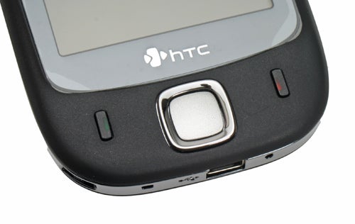
The screen on the Touch isn’t a bad example, but I really would like to see larger devices like this ship with higher resolution displays. After all, the Samsung D600 shipped with a 240 x 320 resolution 2in screen back in October 2005. The screen is bright and has a good viewing angle, while the screen protector that’s bundled in the box does a good job of keeping it scratch free without spoiling the look of the device. 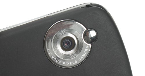
Below the screen is a very cool looking, square four-way navigation key, with a central Select button, and on either side of this are Call and End buttons – there are no soft keys at all. The tactile, rubberised, black finish that covers most of the Touch makes it pleasant to hold and allows you to keep a good grip. There’s a chrome band that runs all around the edge of the device, and this is where all the hard buttons and controls are located. On the left site there’s a rocker switch for adjusting the volume, while the power button nestles on the top edge. On the right is a dedicated button for the 2-megapixel camera, while the stylus slides out at the top right corner. At the bottom is the mini-USB connector, the reset button and a lanyard loop – should you want to hang the Touch around your neck! You need to remove the back of the casing to access the SIM and micro-SD card slots, but at least you don’t need to remove the battery.
Inside the Touch is almost identical to the Orange SPV E650 (or HTC S710 if you prefer). There’s a Texas Instruments OMAP850 processor running at 201MHz, 128MB ROM and 64MB RAM, although there was only 32MB of storage left on my review sample. That said, with a 1GB micro-SD card in the box, storage isn’t really an issue. As I mentioned when I reviewed the E650, this is a pretty modest spec by Windows Mobile device standards, and the Touch does feel a tad sluggish at times.
The Touch is a Tri-band device offering GSM 900, 1800 and 1900 support – again this is quite disappointing, since most handsets are quad-band these days, including the SPV E650. As already mentioned, there’s no 3G support, but the Touch does support EDGE, which does improve data throughput considerably. Unfortunately, EDGE isn’t as prevalent here in the UK as it is in the US. There’s also integrated Wi-Fi and Bluetooth 2.0. 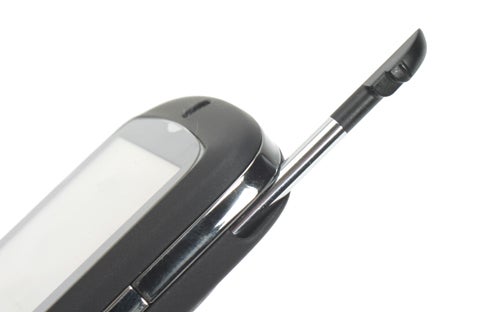
HTC says that the Touch “is a product with something to offer everybody”, but I disagree. I think that the Touch falls between two stools, it’s not feature rich enough to satisfy the power user and it’s not simple and intuitive enough to win over the average consumer. If there were custom applications that made use of the thumb friendly TouchFLO skin, this would be a far better product, but as it stands it’s a feature light Windows Mobile smartphone in a nice case.
Ultimately, HTC should stick to what it’s good at, producing superb power user products like the SPV E650, after all, I can’t see Apple trying to break into the business mobile market anytime soon!
”’Verdict”’
The Touch is a terribly flawed attempt at a mainstream consumer product from HTC. There’s no denying that the TouchFLO interface works well, but all it does is take you to applications which then require traditional Windows Mobile stylus input. It may be the prettiest device that HTC has brought to market, but that’s really all it has going for it.
HTC may be denying that it’s going after the iPhone market, but it’s too much of a coincidence to ignore. But despite being first out of the gate, Apple has absolutely nothing to worry about from a device that doesn’t even have a headphone socket!
How we test phones
We test every mobile phone we review thoroughly. We use industry standard tests to compare features properly and we use the phone as our main device over the review period. We’ll always tell you what we find and we never, ever, accept money to review a product.
Trusted Score
Score in detail
-
Usability 5
-
Value 6
-
Features 6
Editorial independence
Editorial independence means being able to give an unbiased verdict about a product or company, with the avoidance of conflicts of interest. To ensure this is possible, every member of the editorial staff follows a clear code of conduct.
Professional conduct
We also expect our journalists to follow clear ethical standards in their work. Our staff members must strive for honesty and accuracy in everything they do. We follow the IPSO Editors’ code of practice to underpin these standards.